

California casual interior design combines relaxed furniture, warm materials, and an easy relationship with daylight and outdoor views. It often includes layered neutrals, natural-looking textures, and a mix of older and newer pieces. The useful part is its approach to comfortable living, not a requirement to own a coastal house or buy everything in beige.
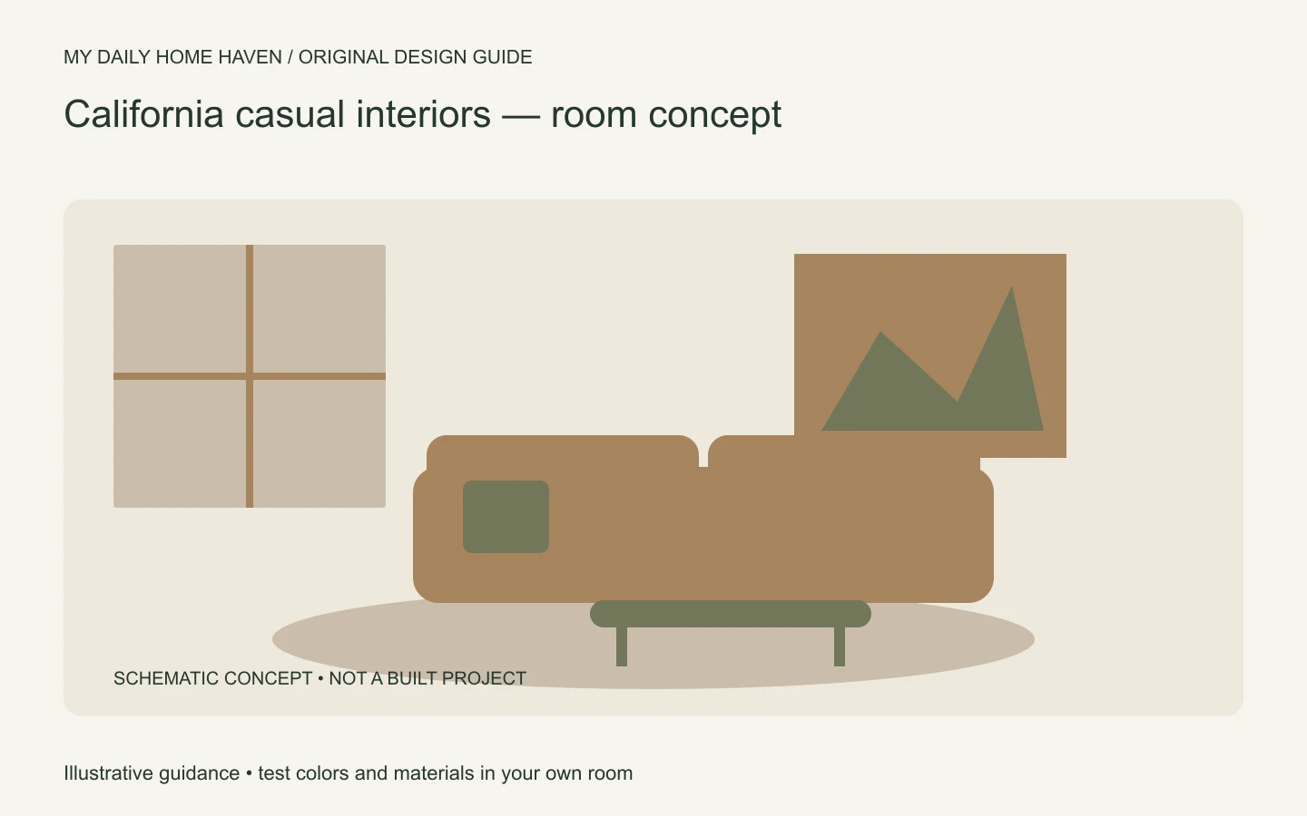
Use this guide to adapt the look to your climate, floor plan, and daily routine. For a wider comparison of relaxed and more formal styles, start with our interior design aesthetics guide.
California Casual Interior Design: Balance Relaxed and Refined
California casual interior design is less about a beige palette than balance: relaxed upholstery, useful natural textures, and enough contrast to keep the room defined. Start with circulation and durable fabrics, then add wood, woven accents, or art where they support everyday use. Avoid buying a complete matching set just to reproduce a photo.
What gives the look its character?
Think of a room that feels considered but easy to use. Seating invites people to stay. Wood grain and fabric texture supply detail. A few stronger shapes prevent the neutral backdrop from feeling flat, while useful storage keeps everyday clutter manageable.
There is no official checklist or single California style. The label overlaps with contemporary, coastal, rustic, and eclectic decorating. As one contemporary reference, Amber Interior Design publishes its own projects and design work. Study the relationship between materials and proportions rather than treating a designer’s room as a shopping list.
Your version can include color, family furniture, and practical window coverings. A home in a cold climate can borrow the relaxed layering without copying an open-air lifestyle that does not suit its weather.
Start with a comfortable furniture plan
Choose the seating arrangement before choosing accessories. Decide where people will talk, read, and watch television. A deep sofa may look inviting but feel awkward for someone who needs a more upright seat. Test seat height and depth when possible.
Leave convenient places for drinks and lighting. If a large sectional fills the room, two smaller seating pieces may offer better movement. Avoid placing a chair in front of an exterior door simply because the arrangement looked good in a photograph.
The space planning guide covers these layout decisions in more detail. Comfortable circulation is part of the relaxed effect; it should not be sacrificed for a particular furniture silhouette.
Make neutrals work together
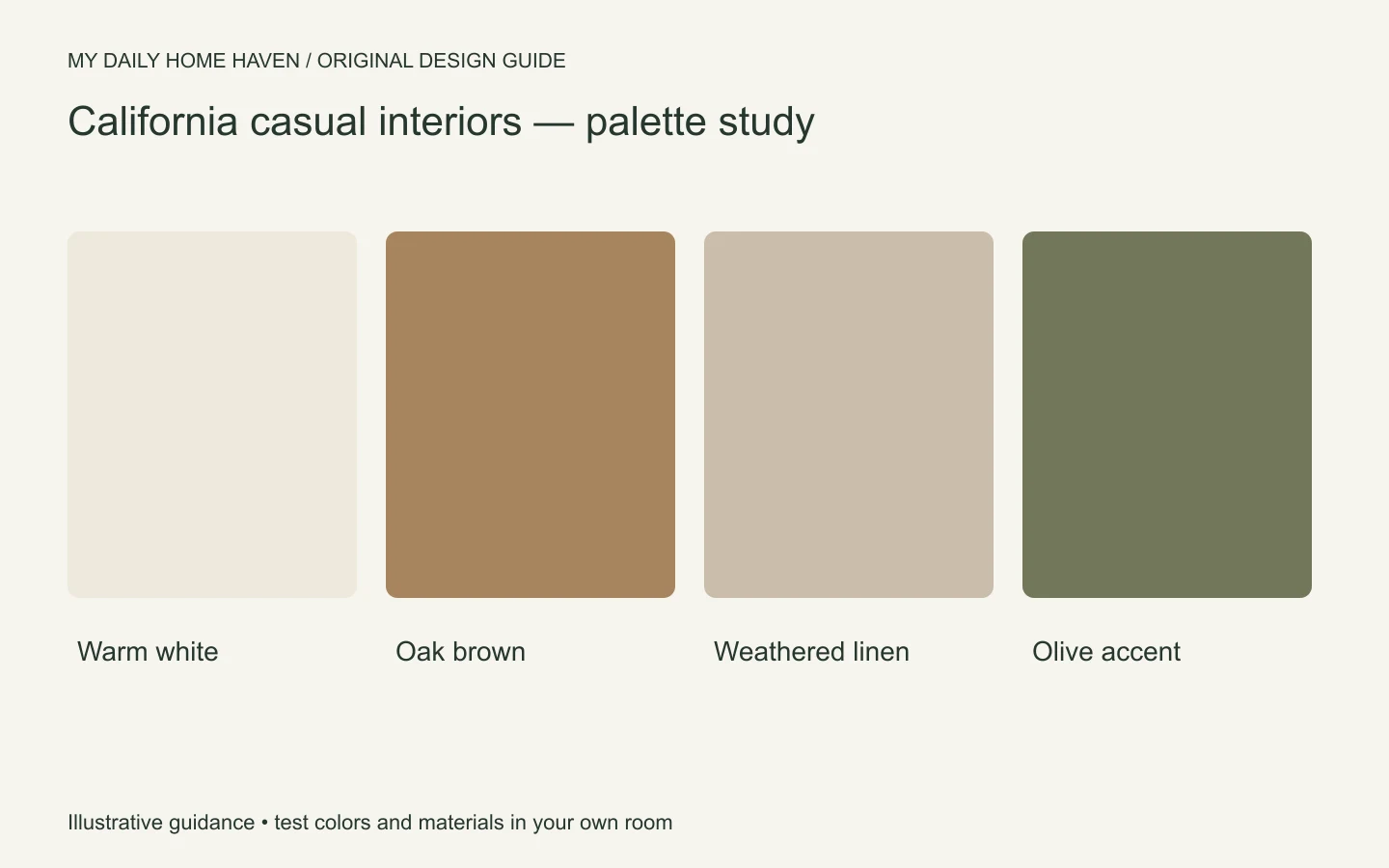
Begin with the fixed finishes: flooring, stone, cabinetry, and existing woodwork. Then compare warm white, oatmeal, taupe, and muted gray samples beside them. A cool white can look disconnected from a very warm floor, while several creamy finishes may become overly yellow together.
Paint manufacturer Benjamin Moore’s color handbook explains that lighting changes the appearance of paint through the day. Test a real sample in your room rather than choosing from an edited social media image.
Add contrast through a darker table, a brown leather chair, or an olive textile. You do not need all three. One or two darker notes can give a pale scheme definition without making it feel busy.
Layer texture without making every surface rough
Use a combination of smoother and more tactile materials. A woven rug can sit with a smooth wood table; linen-like curtains can soften a painted wall. If every surface is heavily textured, the room may feel visually dusty or be harder to clean.
Consider actual care requirements. A pale fabric is not automatically impractical, and a textured fabric is not automatically durable. Ask about removable covers, cleaning methods, abrasion information where supplied, and the treatment of spills. Choose for your household rather than the product’s style name.
Natural materials also vary. Check whether a wood finish shows water rings, whether a basket catches delicate throws, and whether the rug allows a door to open. Samples and return policies are more useful than broad claims that a material is effortless.
Mix old and new with a clear connection
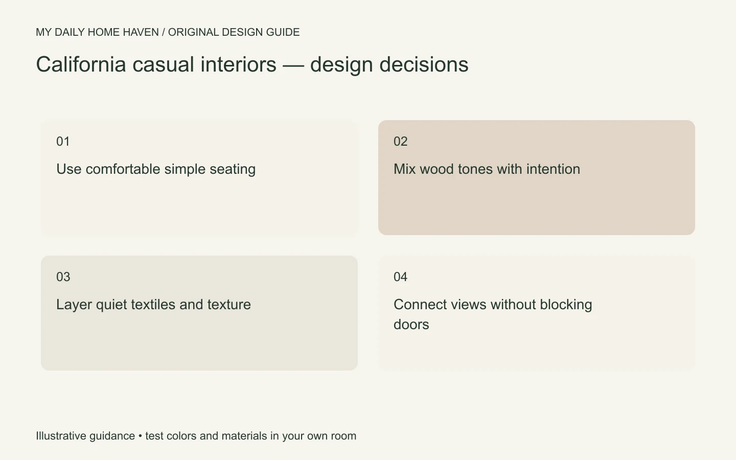
An older chest, a contemporary sofa, and a simple ceramic lamp can work together when they share a related tone or a compatible sense of scale. Matching every wood finish is unnecessary, but repeated tones help the mix feel intentional.
Avoid distressing everything to manufacture a collected appearance. Genuine wear can be part of a piece’s history; deliberate damage is not required. Inspect secondhand furniture for condition, stability, and suitability before arranging delivery.
Keep the largest pieces relatively quiet if you want flexibility. A distinctive vintage table can then provide character without forcing the sofa, rug, and lighting to compete for attention.
Bring in outdoor references realistically
Frame a view with window treatments that open fully when you need daylight. Choose a plant only if you can meet its light and care needs. A branch arrangement, landscape artwork, or outdoor color reference can offer a similar connection without adding a demanding plant.
Do not remove privacy or glare control in pursuit of an airy photograph. Layered window treatments may suit a busy street, a west-facing room, or a bedroom much better than bare glass. Indoor furniture also needs suitable protection if used on a covered patio; appearance alone does not make it outdoor rated.
For a budget refresh, first edit what you own. Move a bulky accessory, simplify the coffee table, and improve a reading light. Then buy the single item that solves the clearest gap, rather than replacing the whole room.
Set a realistic care routine
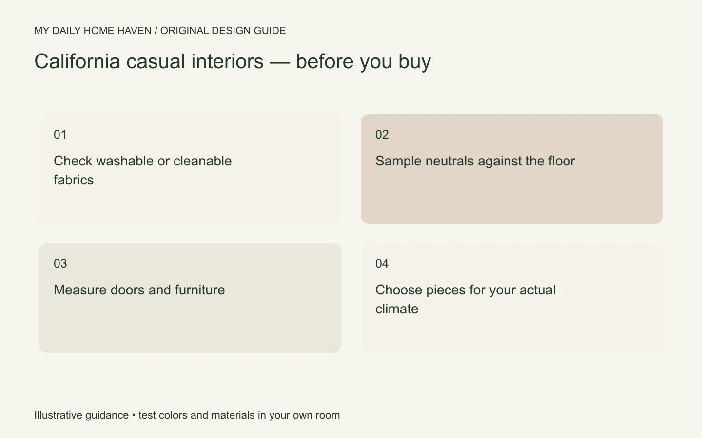
A California casual interior design scheme should remain easy to use after the first week. Ask which covers can actually be removed and cleaned, whether a rug needs professional treatment, and how the table finish handles normal spills. Make those checks before ordering pale upholstery or a heavily textured rug. If the proposed maintenance feels unrealistic, change the material rather than hoping the relaxed appearance means effortless care. You can keep the same palette with a different fabric or finish. A practical room that accommodates real life expresses the approach more convincingly than a fragile arrangement you constantly protect.
Frequently asked questions
Is California casual the same as coastal style?
They overlap, but coastal rooms may refer more directly to seaside colors and settings. California casual can be entirely inland, with no nautical imagery or blue-and-white palette.
Can I use it with dark floors?
Yes. Add contrast through lighter upholstery and walls, then repeat a darker tone in a small piece. Keep samples near the floor so the undertones work together.
How do I stop a neutral room looking bland?
Vary value, shape, and texture. A darker table, one strong artwork, or a curved chair may provide the missing interest. Adding many small beige accessories usually does less to improve the composition.