

Abstract interior design uses shape, color, line, and composition to give a room character. An abstract painting may lead the scheme, but sculptural furniture, a geometric rug, or an unusual lighting form can play the same role. The room still needs a clear layout and comfortable places to sit, work, and move.
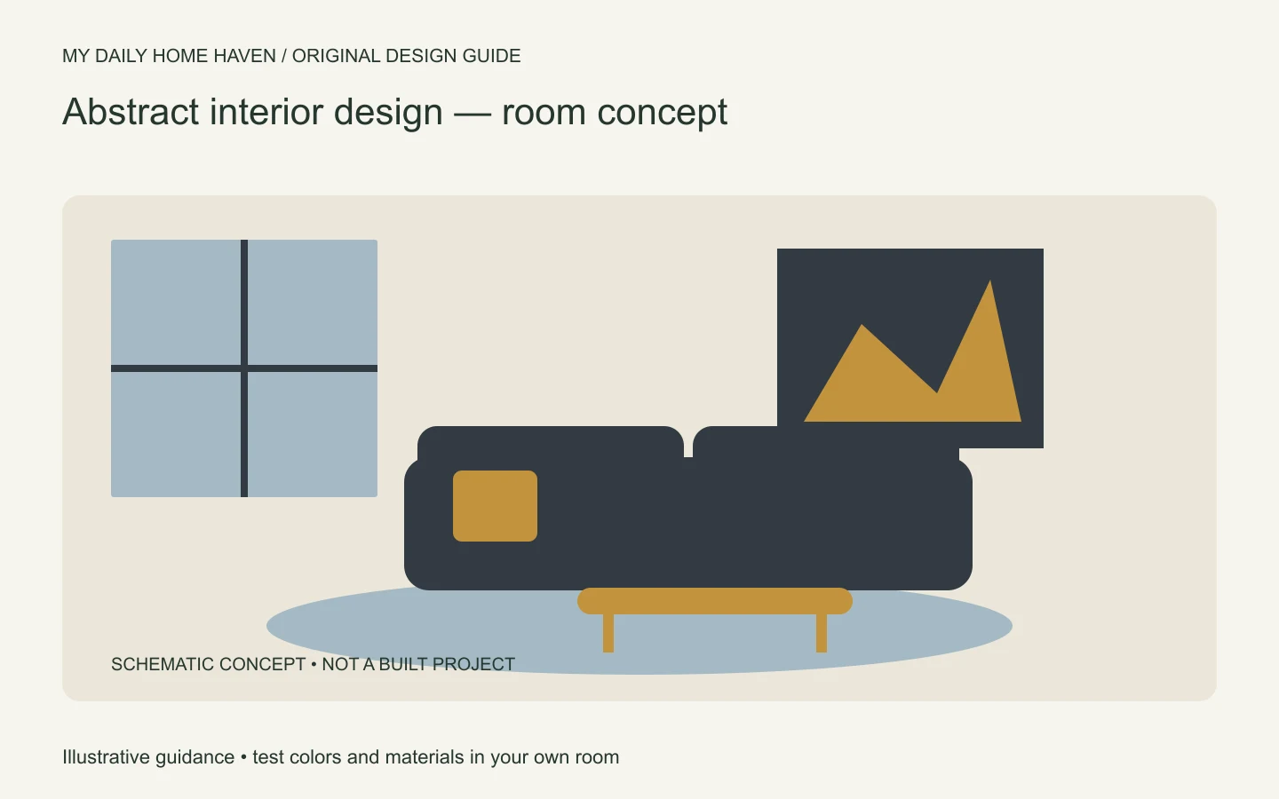
Treat the phrase as a useful decorating description rather than a single historical interior style. This guide focuses on applying abstraction to a livable home. For comparisons with other approaches, see our interior design aesthetics guide.
Abstract Interior Design: Give Shapes a Clear Role
Abstract interior design can guide a room without making every surface compete. Choose one artwork, sculptural form, or color relationship as the starting point; echo its geometry in a rug or light fixture, then keep the main furniture comfortable. Check the composition from the doorway and seating positions before adding another strong shape.
Understand what the artwork contributes
Abstract art does not need to depict a recognizable scene to influence a room. Notice its large shapes, the relationship between light and dark, and the amount of empty space. These features often provide a better starting point than trying to match every color exactly.
MoMA’s account of its Cubism and Abstract Art exhibition shows abstraction across several creative disciplines, including furniture and architecture. That history offers context; it does not mean any curved sofa or patterned rug belongs to a particular art movement.
Choose work because you want to live with it, not because a room needs a fashionable rectangle. Prints, original works, and your own experiments can all contribute. Check reproduction rights and credit the artist when sharing images of the room publicly.
Pick one dominant idea
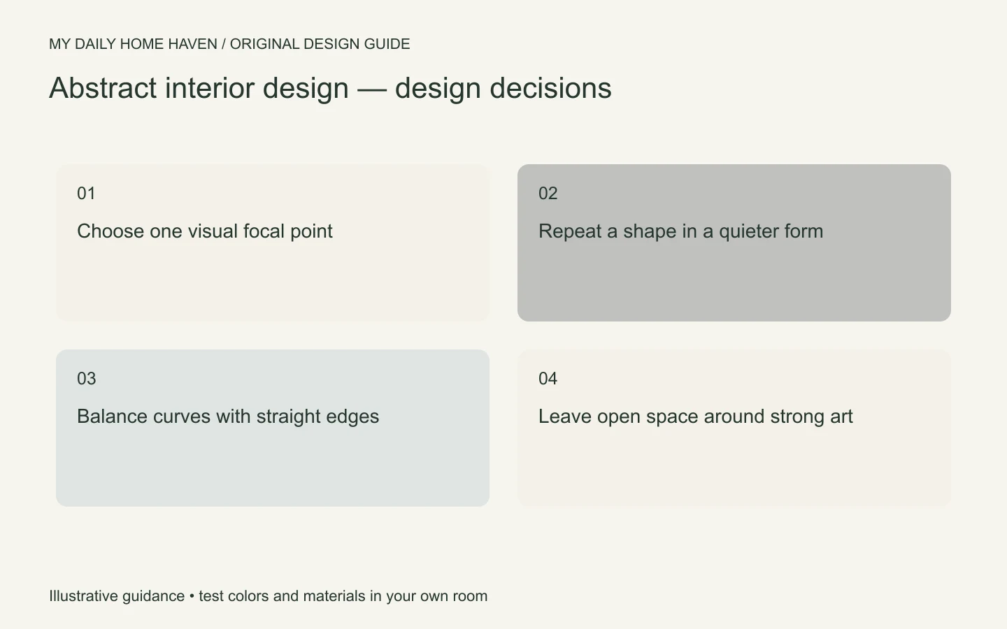
A room becomes easier to compose when one element leads. If a large painting has bold red and black marks, let nearby furniture offer quieter surfaces. If the sofa has an expressive sculptural silhouette, the art can be smaller or more restrained.
Avoid combining a high-contrast rug, a busy mural, several curved chairs, and a dramatic pendant simply because each is interesting. They may compete for the same attention. Establish a hierarchy: one dominant feature, supporting elements, and a calm background.
Take a photograph of the room and view it at a small size. If every object demands equal attention, remove or soften one feature. This is a practical editing tool, not a test of whether your taste is correct.
Translate art into a workable palette
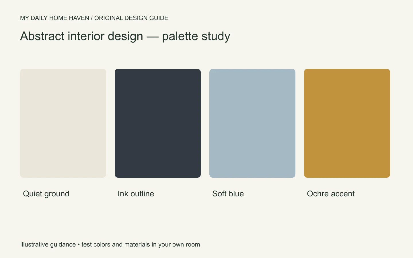
Select a background color, a supporting color, and a smaller accent. They can come from the artwork, but they do not need to reproduce it literally. A blue mark might become a muted blue cushion rather than blue walls, blue curtains, and blue furniture.
Compare actual samples together before ordering. Screen images cannot show a material’s full texture, sheen, or response to light. Place fabric near the floor and wall, then inspect the group during the hours you use the room.
| Artwork feature | Room interpretation | Keep in balance |
|---|---|---|
| Strong black lines | Dark frame or slender lamp | Avoid outlining every object |
| Broad curved form | Rounded chair or table | Retain some straight edges |
| Small vivid accent | Cushion, book, or ceramic | Let larger surfaces rest |
| Large quiet field | Plain wall or simple upholstery | Do not fill every gap |
Mix geometric and organic shapes
Straight edges give a layout structure. Curves can soften that structure, especially around rectangular windows and cabinets. A round table beside a linear sofa may be enough; the whole room does not have to become a collection of waves and blobs.
Watch the footprint as carefully as the silhouette. A sculptural chair can occupy more floor space than it appears to in a product photograph. Measure its widest point and allow for the way someone approaches and sits in it.
Keep functional surfaces usable. A highly irregular coffee table may have little stable space for a tray. If it is the room’s statement piece, add an unobtrusive side table where a person can safely put a drink.
Plan the room before hanging the art
Position the seating and establish the main sightline first. Then assess the art in relation to the furniture group, rather than centering it automatically on the whole wall. Paper templates help you compare arrangements without drilling repeated holes.
Do not cover switches, vents, or access panels. Use fixing methods suited to the wall and the artwork’s weight. Heavy or delicate pieces may need a professional installer. Keep valuable work away from conditions the artist or conservator identifies as unsuitable.
Our space planning guide can help you test circulation before committing to a large piece. A powerful composition loses its appeal if people have to squeeze around it.
An example with ordinary furniture
Consider a rectangular living room with a gray sofa and oak floor. Introduce an abstract print with off-white space, dark lines, and one ochre shape. Use a slim dark lamp to echo the lines and a single ochre cushion to connect the accent.
A rounded wood side table can bring in a second shape without adding another strong color. Keep the main rug relatively quiet, especially if the painting has small repeated marks. The room now has a visual idea without requiring an entirely new furniture set.
If the result feels too stark, add texture before adding more artwork: a woven throw, a fabric lampshade, or a low-contrast rug. Texture changes the room’s tactile quality without necessarily increasing its visual noise.
Choose the scale before the frame
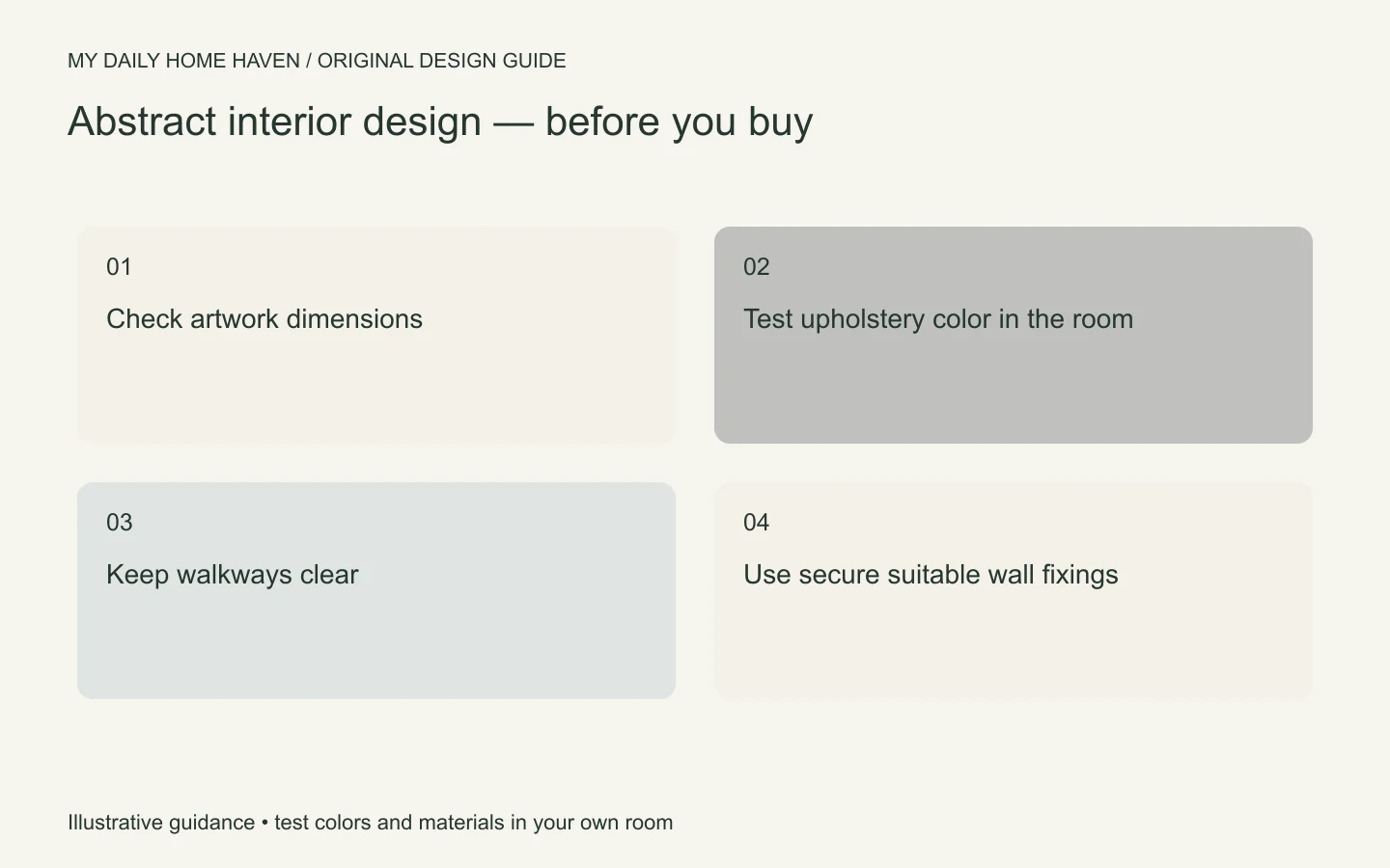
For abstract interior design, test the relationship between artwork and furniture with paper rectangles before selecting a frame. Include the frame width in the overall dimensions rather than measuring only the image. Stand at the entrance and sit in the main chair to compare both views. A work that looks balanced from across the room may feel crowded when seen close to a tall lamp or cabinet. If you are arranging several pieces, establish their spacing on the floor first. This small planning step helps you avoid unnecessary holes and makes the collection easier to adjust later.
Frequently asked questions
Does abstract decorating have to be minimalist?
No. Layered rooms can use abstraction too. Give each strong piece enough space and connect the collection through a limited palette, consistent framing, or a repeated material.
Can I mix abstract art with traditional furniture?
Yes. The contrast can be effective when scale and color relate. Try the art above a traditional chest, then keep nearby accessories simple so both pieces remain readable.
What if I cannot afford a large artwork?
Try a properly framed print, a smaller work with generous surrounding space, or a carefully arranged group. Buying the largest available canvas is less useful than choosing work you enjoy and positioning it thoughtfully.