

Earthy interior design uses grounded colors and tactile materials to create a room connected visually to soil, stone, plants, and timber. Think clay, muted green, warm brown, chalk, and sand, combined with a mix of smooth and textured surfaces. The room can be modern, traditional, or eclectic.
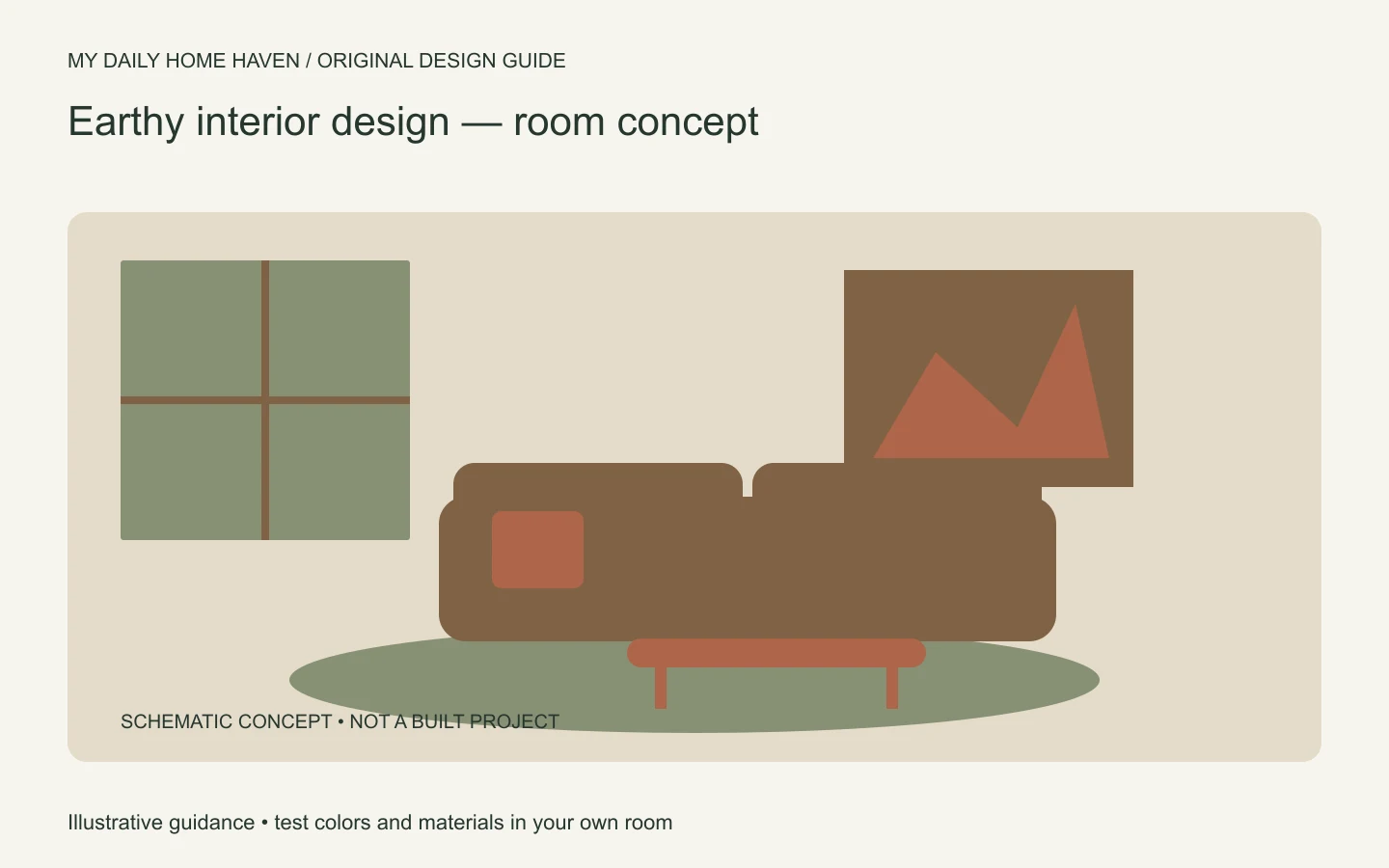
The important distinction is that an earthy appearance does not automatically make a product sustainable, healthy, or low-maintenance. Choose the visual direction and the material performance separately. Our interior design aesthetics guide explains how this palette can fit different styles.
Earthy Interior Design: Connect Color and Material
Earthy interior design works best when its palette is grounded in the room’s daylight, existing finishes, and practical needs. Compare warm and cool undertones before choosing paint; then layer wood, woven textiles, stone, or clay where their care requirements make sense. A few varied surfaces create depth without turning every element into a matching natural texture.
Read the materials you already have
Start with flooring, cabinets, counters, and furniture you plan to keep. These often contain the palette already: a warm oak floor, gray stone, or a reddish brick fireplace. Work with the strongest existing tones rather than adding several new finishes that compete with them.
Photograph the room, but also inspect it directly. Cameras and screens change color relationships. Place real fabric and paint samples next to the fixed finishes and view them in daylight and under your normal evening lights.
If the floor is very warm, a quieter neutral wall may give it breathing room. If the room is mostly pale and smooth, a darker timber piece or textured textile may provide the missing depth. The solution depends on the starting point.
Build a palette with both warmth and relief
Choose a main background, a supporting material color, and a smaller accent. For example, chalk-colored walls can support brown timber and muted olive textiles. A terracotta bowl or artwork can add warmth without turning every surface orange.
Keep some variation in value. A room where walls, sofa, curtains, and rug are all the same mid-brown can feel visually heavy. Lighter surfaces, darker outlines, and a little open space help the individual materials remain visible.
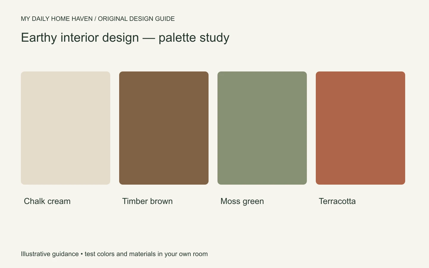
There is no mandatory earthy paint shade. Test a sample beside your upholstery and floor before committing. A color that reads as soft clay in one room may look noticeably pink or orange in another.
Compare texture with maintenance
Rough and woven materials can add character, but they also behave differently in daily use. A heavily textured rug may catch crumbs; a delicate basket may snag fabric; an unfinished-looking table may still have a coating that needs particular care.
| Material choice | Visual contribution | Question to ask |
|---|---|---|
| Woven textile | Softness and visible structure | Can it be cleaned for this use? |
| Timber furniture | Grain and warm color | What finish protects the surface? |
| Natural stone | Variation and visual weight | What stains or etches it? |
| Ceramic object | Shape and glaze contrast | Is it watertight if used as a vase? |
Use these questions before buying rather than after a spill. A material’s name does not tell you everything about its performance. Ask for written care guidance and check whether replacement parts or repairs are practical.
Keep the room from becoming a rustic theme
Earthy interiors do not require distressed wood, decorative antlers, or a collection of rustic signs. Clean-lined furniture can provide a useful contrast to visible grain and woven surfaces. A smooth lamp or simple framed print can keep the room from looking overly rough.
Choose a few material families and repeat them. If you introduce five different baskets, several kinds of stone, and many timber tones at once, the room may become busy. Editing can make a single handmade piece easier to appreciate.
Bring in plants only where they can thrive and where you can care for them. Landscape artwork, a view, or a color taken from a favorite outdoor place can provide a visual reference without requiring a large indoor plant collection.
Separate natural appearance from environmental claims
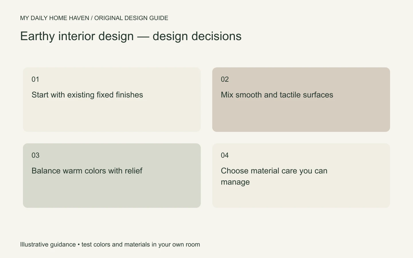
Words such as natural, organic-looking, and earth-friendly can mean different things in product descriptions. Ask about the actual material, manufacturing information, durability, and relevant certifications rather than relying on the color or texture.
Keeping useful furniture can be part of a more considered project. The US EPA’s waste guidance includes repair and reuse among its recommended actions. That supports evaluating what you already own before replacing it for a new look.
Our sustainable interior design guide covers this broader decision-making. An earthy palette and an environmentally informed project can overlap, but one does not prove the other.
A practical room refresh
Consider a living room with a serviceable beige sofa and dark wood table. Keep both. Add a textured cushion in a muted green, replace a visually busy small rug with one that better connects the seating group, and simplify the table display.
Before replacing the lighting, try moving an existing lamp to the reading seat. Before ordering curtains, hang a large fabric sample near the window. These tests help you identify the missing function or color relationship rather than buying a complete style package.
Set aside part of the budget for care and fitting. Rug underlay, curtain alterations, or a proper furniture repair may contribute more to the finished room than another decorative purchase.
Ask for product facts
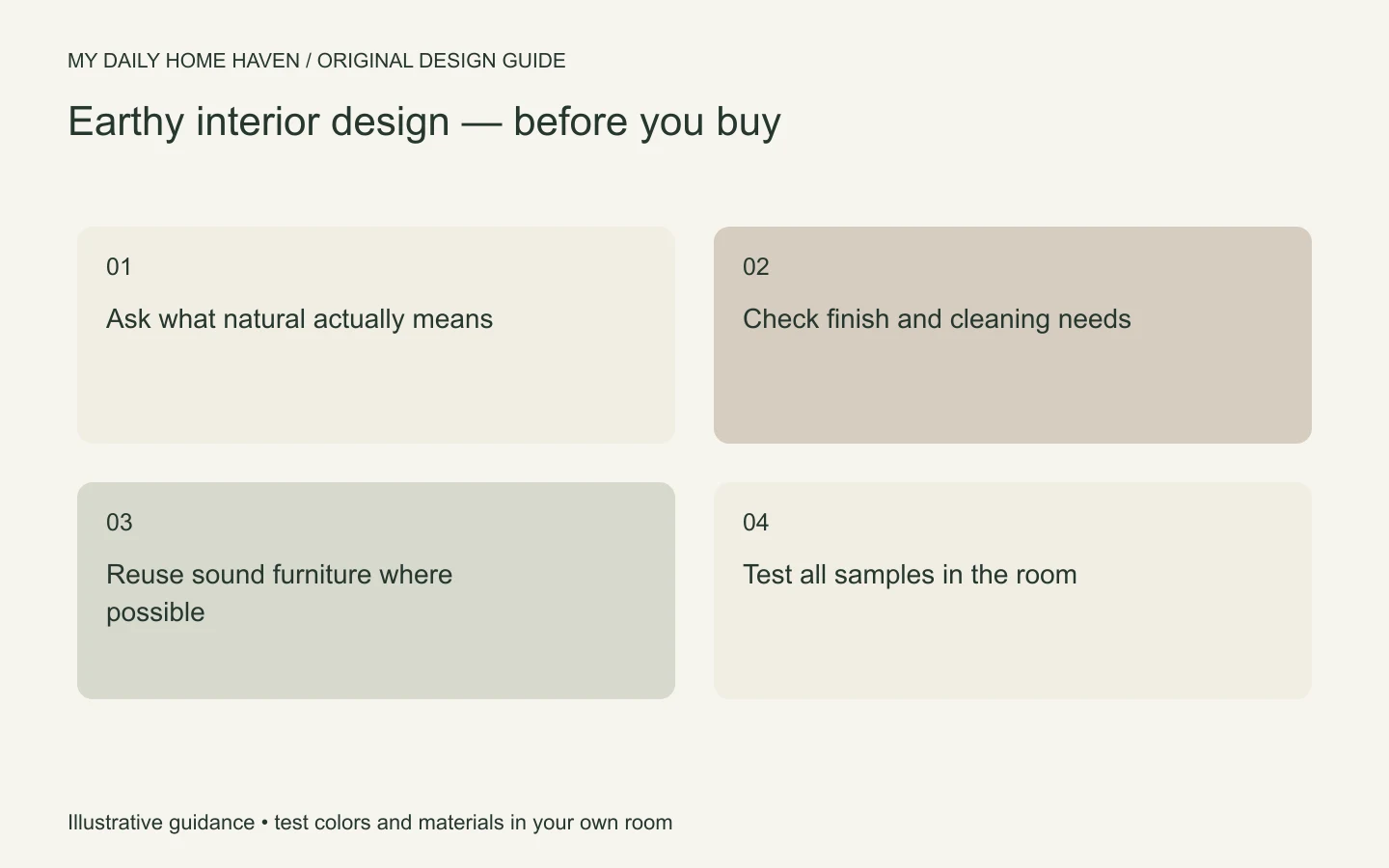
In earthy interior design, a convincing natural-looking photograph can hide important material differences. Ask whether a surface is solid timber, veneer, laminate, stone, ceramic, or another product, and how it is finished. None of those answers automatically decides the purchase, but the information affects repair, cleaning, and expected wear. Request dimensions and care guidance in writing for major items. If an environmental claim influences your choice, ask what evidence supports that specific claim. A clear product description is more useful than a set of comforting words that do not explain what you will actually receive or maintain.
Frequently asked questions
Can earthy rooms include black or metal?
Yes. Dark outlines and metal surfaces can give a warm palette definition. Use them in a way that supports the room rather than assuming every finish must look raw or unprocessed.
Does earthy design have to be dark?
No. Pale chalk, sand, and light timber can make a bright scheme. Add texture and a little darker contrast so the materials do not disappear into one flat field.
Is faux stone always the wrong choice?
No. Evaluate the actual product, intended use, appearance, and care requirements. A stone-look finish may suit a project, but it should be described accurately and not sold as natural stone.