

Balance in interior design describes how a room distributes visual weight. Objects can feel more prominent because of size, darkness, height, pattern, or density. You can create balance with matching pieces or with different elements that work together. Begin by reviewing the whole arrangement rather than buying a matching object for every empty spot.
Our interior design principles guide explains the broader relationships. Here, the focus is diagnosing visual weight and choosing a practical way to redistribute it.
Separate visual weight from physical weight
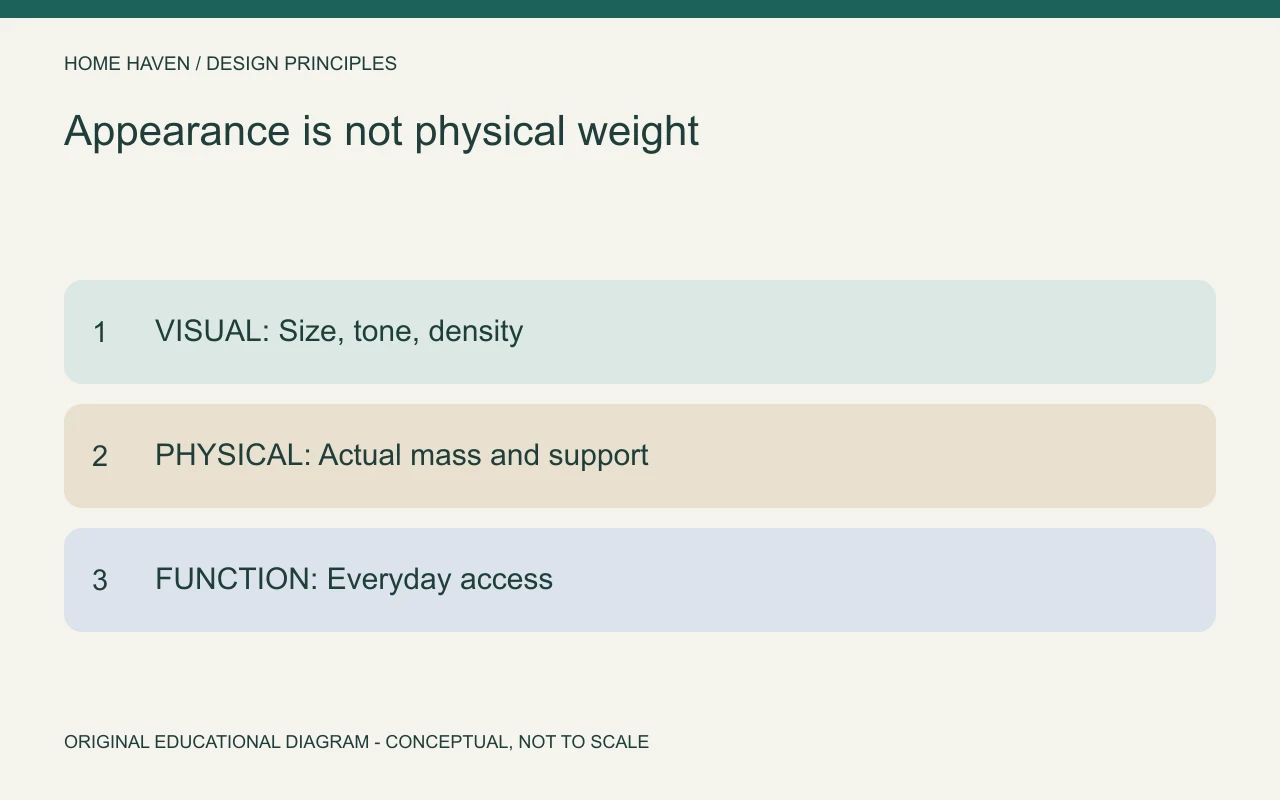
A light-colored open shelf can feel less visually dense than a solid dark cabinet with similar dimensions. That observation concerns appearance, not the object’s actual mass or structural load. Installation and support still depend on real product and building information.
Review height, solid surfaces, color, texture, and the amount of surrounding empty space. A group of small objects can create a dense area even when each piece seems minor. Look at the group before judging the individual accessories.
Three ways to create balance in interior design
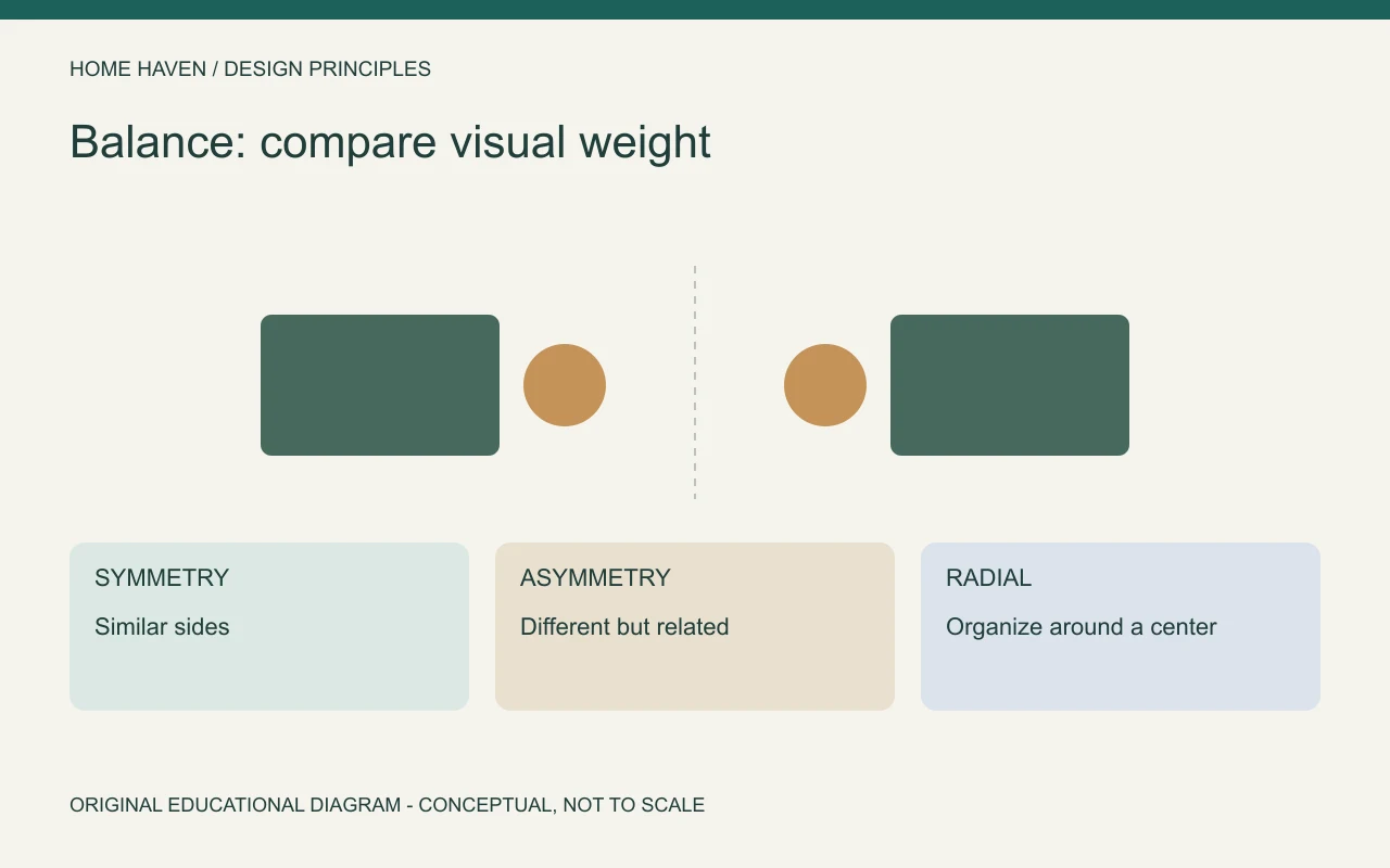
Symmetrical arrangements relate similar elements across an axis. Asymmetrical arrangements use different elements whose combined presence feels considered. Radial arrangements organize objects around a center, such as chairs around a round table.
Getty’s discussion of balance provides a general visual-art foundation. The room examples below are applications of that idea, not a requirement that every interior use the same composition.
- Symmetry: use related sides when a clear axis suits the room.
- Asymmetry: compare the combined presence of different objects.
- Radial organization: review the center and access around it.
- Mixed arrangements: balance a main grouping while allowing the wider room to vary.
Use symmetry where the room supports it
A bed with similar tables and lamps can form a clear composition. A fireplace can provide an axis for paired furniture or artwork. Symmetry often offers a straightforward starting point when the architecture and use already align.
Do not force identical pieces into unequal spaces. A door beside one side of a bed may make a smaller table more practical. You can retain a visual relationship through lamp height, material, or overall presence without sacrificing access.
Balance different objects through the whole group
Asymmetrical balance is useful when you already own varied furniture. A tall plant and a low cabinet may counter a denser seating group elsewhere. The objects do not need to match, but their relationship should remain intentional.
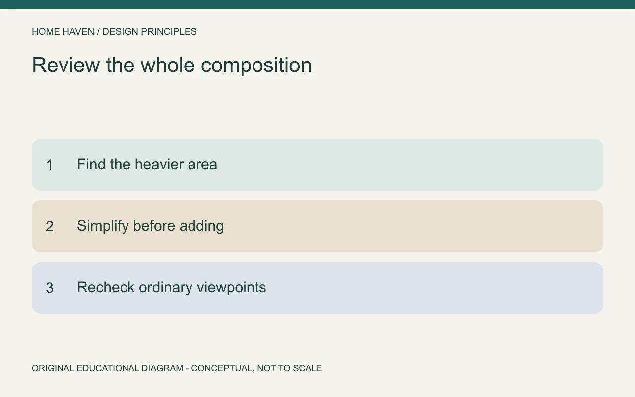
Try removing or simplifying something on the visually heavy side first. Filling the quieter side can add clutter without solving the underlying problem. Compare the room after each change rather than assuming more objects create more balance.
Check the center in a radial arrangement
A round dining table can organize chairs around a shared center. A circular rug or pendant may reinforce that relationship visually. However, the arrangement must still provide practical access for the people using it.
Review chairs when occupied and pulled out, not only when tucked in. A radial composition can look orderly from above while creating an awkward route beside the table. Use measured planning alongside the visual review.
Look beyond the furniture
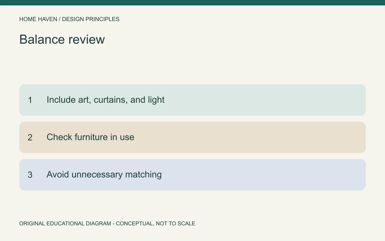
Curtains, art, plants, windows, and lighting also affect the composition. A wall of dark curtains can give one side more presence even when the furniture seems evenly distributed. A bright window may draw attention without adding physical objects.
Review the room in daylight and under typical evening lighting. The balance can appear different when the window becomes dark and lamps become the brightest elements. Choose an arrangement that works across the conditions you actually use.
A practical balance review
Stand in the doorway, then sit in the main chair. Identify the visually heaviest area from each position. Note what contributes to it: a tall object, a dark finish, clustered accessories, or a busy pattern.
Next, test a small correction. Move a lamp, reduce a shelf display, or change the grouping of artwork. Compare photographs from the same position. Avoid changing several major elements together, because that makes it harder to understand the result.
Hypothetical living room example
Imagine a room with a dark sofa and a tall bookcase along one side. The opposite side contains only a small chair. Buying a second bookcase might create visual repetition, but it could also make the room feel crowded.
Instead, simplify the first bookcase, move a floor lamp near the chair, and review the artwork above it. The aim is to distribute presence with useful elements. The solution depends on the actual room rather than a formula that assigns fixed visual weights.
Keep balance and function together
An arrangement can appear balanced while placing everyday storage out of reach. Conversely, a functional room may only need a small visual adjustment. Evaluate the people, activities, and movement before choosing a decorative correction.
Our space planning guide helps with the measured side of that review. Keep doors, drawers, furniture in use, and ordinary routes visible in the plan. Balance should support the room’s daily purpose.
Avoid mechanical matching
A matching furniture set does not guarantee balance. Several similar pieces can still cluster on one side or compete with the architecture. Likewise, a collection of different pieces can work well when the overall relationships are clear.
Repeat a limited material or color when it helps connect different objects. Then judge the complete composition. Do not assign imaginary percentages to visual weight or treat a decorating ratio as a universal requirement.
Balance questions
Is asymmetry the same as imbalance?
No. Different sides can form a considered composition. The question is how their combined visual presence relates, not whether every object has a duplicate.
Should every view look equally balanced?
Different viewpoints can have different priorities. Review the views people use most and avoid correcting a minor camera angle at the expense of the main arrangement.
Start by simplifying the heavier side
Identify the strongest area, test one small change, and compare the result in normal use. A balanced room can emerge from rearranging and editing what you own. Matching purchases are only one possible tool.