

Contrast in interior design makes differences visible. Light and dark, smooth and rough, curved and straight, or large and small elements can help a room read more clearly. Use contrast to support a purpose, such as defining a furniture group or drawing attention to art. Adding stronger differences everywhere can create competition instead of clarity.
Our interior design principles guide explains the wider relationships. This article focuses on choosing the kind of contrast, comparing it in the real room, and keeping supporting areas quieter.
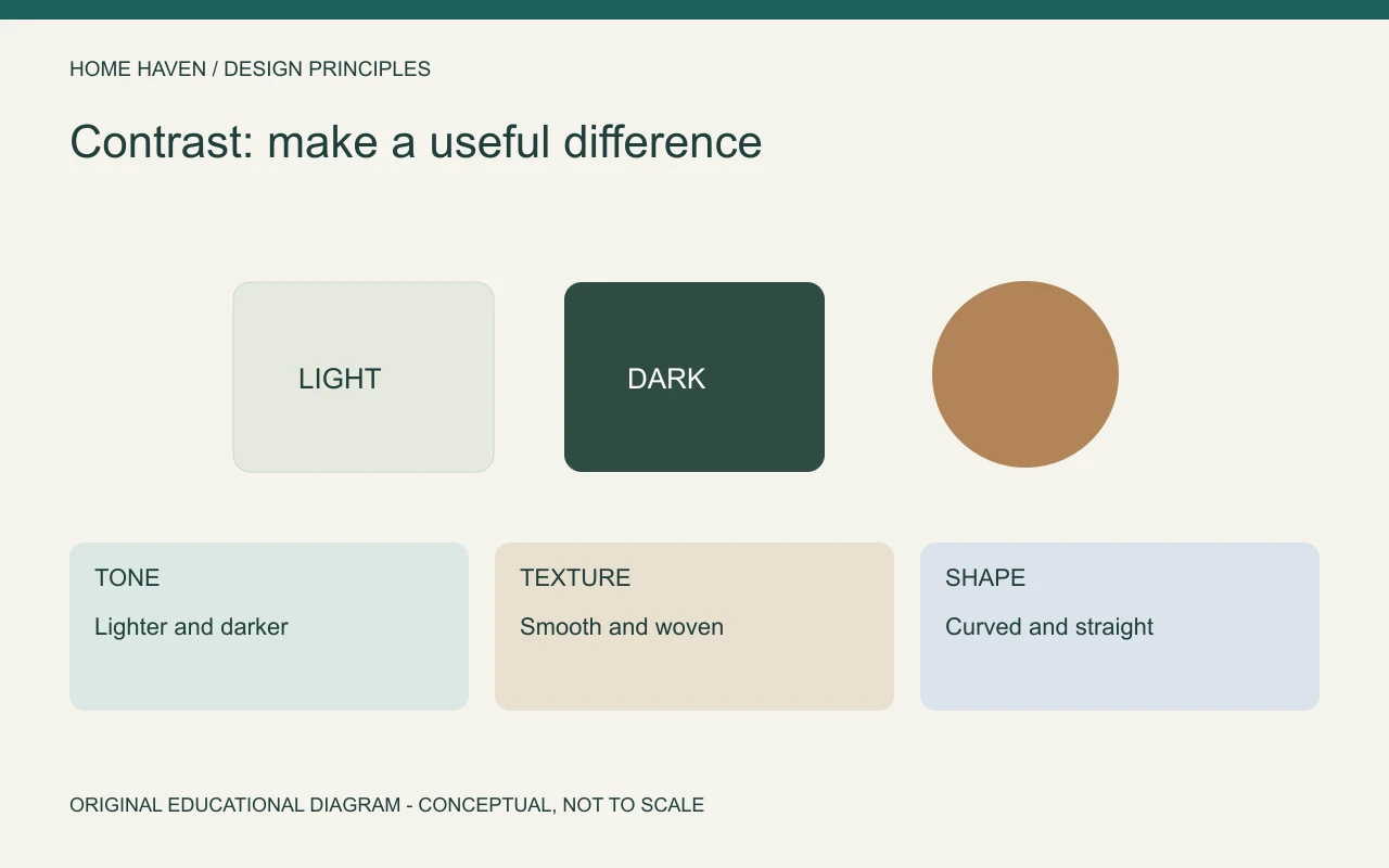
Decide what needs definition
Look for a relationship that feels unclear. A pale chair may disappear against a pale wall, or an important artwork may compete with a busy background. Identify the specific problem before introducing another color or material.
Sometimes the room needs a clearer boundary; sometimes it needs less activity. If every object already stands out, adding more contrast may make the problem worse. Start with one view and one intended priority.
Contrast in interior design is broader than black and white
Tone describes how light or dark a surface appears. Texture, shape, scale, and finish can create other differences. A room can have a restrained palette while still offering contrast through a woven textile beside a smooth table.
Purdue University Libraries’ design basics guide includes contrast among general design concepts. The room comparisons here are practical interpretations, rather than requirements for particular color combinations.
- Tone: compare lighter and darker surfaces.
- Texture: compare smooth, woven, rough, or softly layered materials.
- Shape: relate curved forms to straighter lines.
- Scale: compare the presence of larger and smaller elements.
- Finish: review matte and reflective surfaces in the actual lighting.
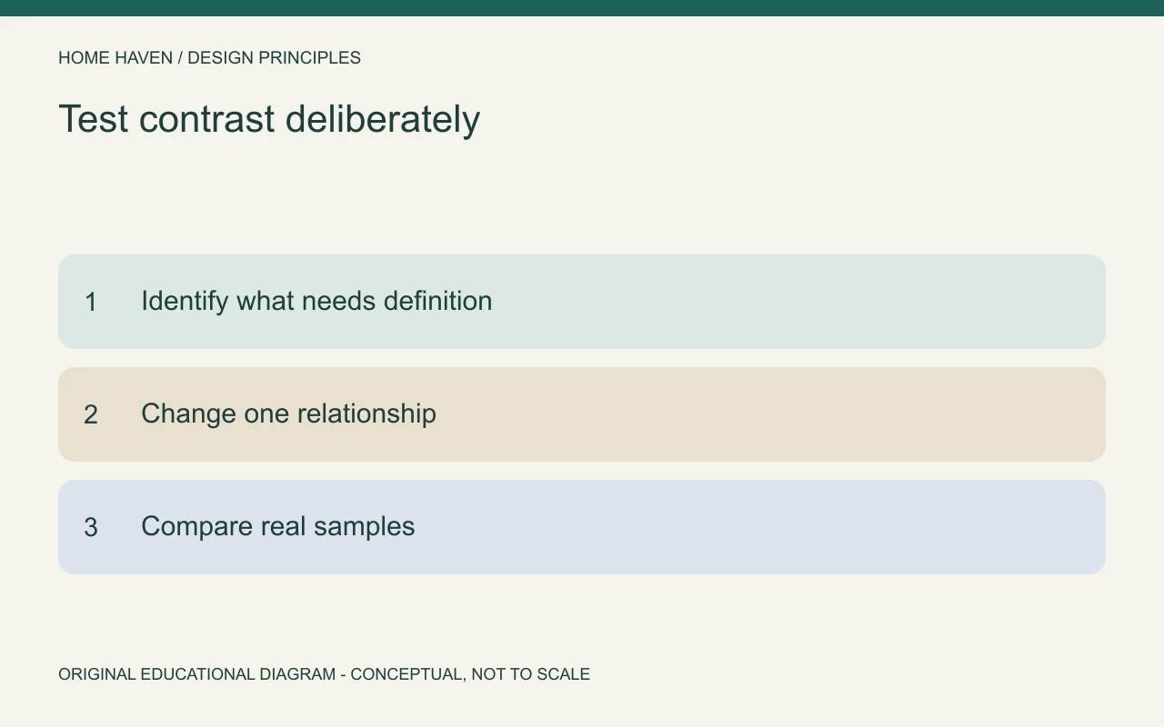
Use tonal contrast to clarify a composition
A darker object against a lighter background can become more distinct, and the reverse can work as well. The effect depends on the surrounding area and lighting. You do not need to use the strongest possible difference.
Try a temporary fabric or paper sample before changing a large surface. Photograph the view under similar conditions, then compare the relationship. A small digital swatch may not predict the effect of a full wall or large piece of upholstery.
Build interest through texture
A smooth cabinet, woven rug, and soft upholstery can offer variety without several strong colors. Consider texture both visually and through the way people use the objects. A surface that looks inviting may still be unsuitable for the household’s cleaning needs.
Review real samples and care information before purchasing. Do not infer durability, comfort, or maintenance requirements solely from a photograph. The practical material choice needs more evidence than its contribution to the visual composition.
Use shape to soften or reinforce a room
A round mirror or curved chair can contrast with a room dominated by rectangular cabinetry. Alternatively, straight lines can bring definition to a softer furniture group. Choose the relationship that suits the existing pieces rather than introducing a motif everywhere.
Keep the actual footprint visible. A curved chair may appear visually light while still occupying substantial floor area. Use measured dimensions and review furniture in use alongside the shape comparison.
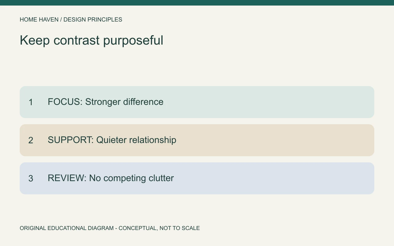
Keep contrast near the intended emphasis
Give the strongest differences a clear role. An artwork may stand out against a quiet wall, while nearby accessories use a softer relationship. That hierarchy helps the room avoid a collection of equally demanding features.
A room can contain several interesting areas, but each view benefits from deliberate priorities. Review the space from the doorway and main seating position. What attracts attention should support the way the room functions.
Review contrast in daylight and evening light
A glossy surface can reflect a window during the day and a visible lamp at night. A pale wall may look different beside a warm lamp than under daylight. Compare materials in the conditions the room actually experiences.
Do not judge only under a store’s lighting or through a phone display. Use samples near the intended location and consider neighboring finishes. The result depends on the combination, not simply on the name of each color.
A hypothetical neutral-room example
Imagine a living room with pale walls, a pale sofa, and a pale rug. The owner wants more definition without repainting. One trial introduces a darker side table and a textured cushion while retaining the main furniture.
Review whether those changes clarify the group or become isolated dark spots. A related tone in artwork may connect the composition, but it is not automatically necessary. Add one element at a time and stop when the intended relationship becomes clear.
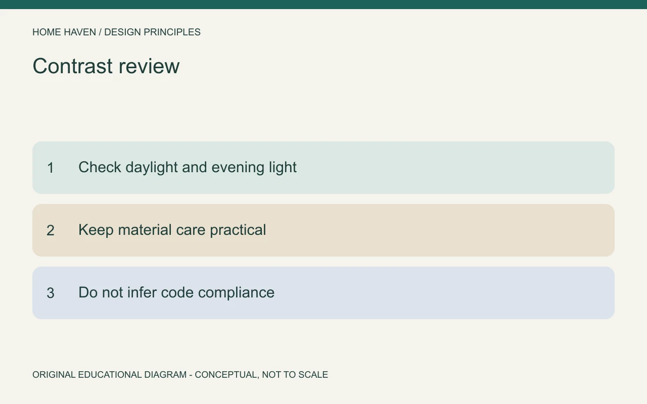
Avoid confusing visual contrast with accessibility compliance
Decorative contrast can make an edge or object easier to distinguish, but a styling exercise does not establish compliance with accessibility requirements. Specific spaces and applications can require appropriate technical assessment. Keep that separate from choosing a pleasing palette.
Also consider glare, lighting, and the people using the room. A high-contrast pattern can create visual activity without helping a particular task. Ask users what they need instead of assuming stronger contrast always improves the experience.
Edit competing patterns
Two busy patterns can compete even when their colors relate. Compare their scale, density, and placement. A quieter neighboring surface may let one pattern become the focus without requiring every textile to match.
Remove a patterned accessory temporarily before buying a replacement. If the room becomes clearer, the solution may be editing rather than adding. Keep surfaces usable and avoid treating empty space as an unfinished decorating problem.
Contrast questions
Can a low-contrast room still feel interesting?
Yes. Texture, shape, light, and carefully chosen details can provide variety. Low contrast is a visual direction, not an automatic absence of character.
Should every room contain black?
No. A darker element can help define some arrangements, but black is not a compulsory ingredient. Choose a relationship that suits the room and its existing materials.
Make a useful difference
Identify what needs definition, choose one kind of contrast, and test it in place. Keep the strongest differences connected to the intended focus. The aim is a more readable room, not maximum visual intensity.