

The principles of interior design explain how a room’s parts work together. Balance, scale, proportion, rhythm, emphasis, contrast, and unity help you arrange furniture, color, light, and decorative objects with purpose. They are useful ways to evaluate a room, rather than strict rules that every home must follow.
You do not need a design qualification to use them. Start by noticing what feels awkward in your room. Then change one relationship at a time instead of replacing everything at once.
On this page: Principles versus elements of interior design · 1. Balance: distribute visual weight · 2. Scale: relate objects to the room and its users · 3. Proportion: judge relationships between parts · 4. Emphasis: decide what deserves attention · 5. Rhythm and repetition: create visual connections · 6. Contrast: create useful difference · 7. Unity and harmony: connect the whole room · Apply the principles together · A practical room review you can do today · Use principles without turning them into restrictions · Frequently asked questions · Improve one relationship at a time
Principles versus elements of interior design
Elements are the things you work with, such as space, line, shape, color, texture, and light. Principles describe how you organize those things. A lamp contributes shape, light, and material; its relationship to a sofa involves scale, balance, and emphasis.
Different design teachers group and name the principles differently. There is no single compulsory checklist that turns a room into good design. The practical question is whether a principle helps you understand and improve the space in front of you.
The Getty’s guide to formal analysis explains related concepts in visual art. The examples below adapt those broad visual ideas to everyday rooms; they are practical decorating interpretations, not building standards.
1. Balance: distribute visual weight
Balance describes how a composition distributes visual weight. In a room, size, darkness, pattern, height, and density can all attract attention. A large dark cabinet may feel visually heavier than a similar-sized open shelf.
Stand in the doorway and look across the room. If one side feels crowded while the other feels empty, the problem may be balance. You might solve it by moving a lamp, grouping artwork differently, or simplifying a display rather than adding more furniture.
Symmetrical balance
Symmetry uses similar arrangements on opposite sides of an organizing point. Matching bedside lamps are an easy example. It can create a clear, settled composition and often suits a more formal arrangement.
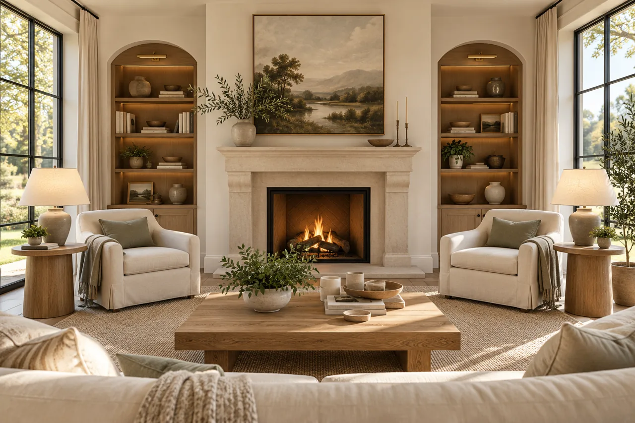
However, symmetry should serve the room. If one side of the bed sits near a doorway, forcing two identical tables into the space may make access worse. Visual order is useful only when the arrangement still works.
Asymmetrical balance
Asymmetry uses different objects that feel balanced together. A tall floor lamp might visually counter a lower cabinet with artwork above it. The objects do not need to match, but their combined presence should feel intentional.
Try removing something from the heavier side before filling the lighter one. Adding another object is not always the best correction. This makes balance particularly useful when working with furniture you already own.
Radial balance
Radial arrangements organize elements around a center. Chairs around a round dining table offer a simple example. The arrangement can encourage a shared focus, but you still need to check access and the occupied chair positions.
2. Scale: relate objects to the room and its users
Scale concerns how large something feels in relation to its surroundings or a person. A sofa can fit between two walls and still dominate the room. Conversely, a small picture can look isolated above a broad sideboard.
Measure before shopping, but also compare heights, depths, and visual bulk. Two chairs with the same footprint may feel different if one has a solid high back and the other has a lighter frame. Dimensions alone do not describe the whole visual effect.
Use the largest pieces as reference points
Start with the bed, sofa, dining table, or main cabinet. Then consider the scale of surrounding items. A tiny bedside lamp may look awkward next to a tall headboard even when it provides enough light.
Do not assume a small room needs only small furniture. Several undersized pieces can create more clutter and fewer useful seats than one carefully chosen larger item. Compare the complete arrangement before judging individual products.
Check real use as well as appearance
Seat height, reach, and storage access matter to the people using the room. A dramatic low table may not suit a household that finds bending difficult. A display can look balanced while placing everyday objects out of reach.
Our space planning interior design guide covers measurements, activity zones, and circulation. Use that practical plan alongside visual scale rather than treating them as separate projects.
3. Proportion: judge relationships between parts
Proportion concerns how parts relate to one another. Think about a lampshade relative to its base, artwork relative to furniture beneath it, or a chair’s back relative to its seat. A mismatch can feel noticeable even when each item looks attractive alone.
Use proportion as a question, not a rigid calculation. Does this object support the arrangement, or does its size distract from it? Is the relationship deliberate, and does it still function?
Why universal decorating ratios can mislead
Rules about exact artwork width or rug coverage can offer a starting point. They cannot account for every room, object, or viewing angle. A group of small pictures may carry as much visual presence as one larger piece.
Use paper templates to test artwork before making holes. Lay out a rug’s proposed dimensions with removable tape. Judge the relationship from the positions where you actually sit and enter the room.
Scale and proportion work together
An oversized pendant may be proportional to a large table but out of scale with a low ceiling. Likewise, a generous sofa may suit the room while its side table feels too small. Evaluate both the whole room and the smaller relationships inside it.
4. Emphasis: decide what deserves attention
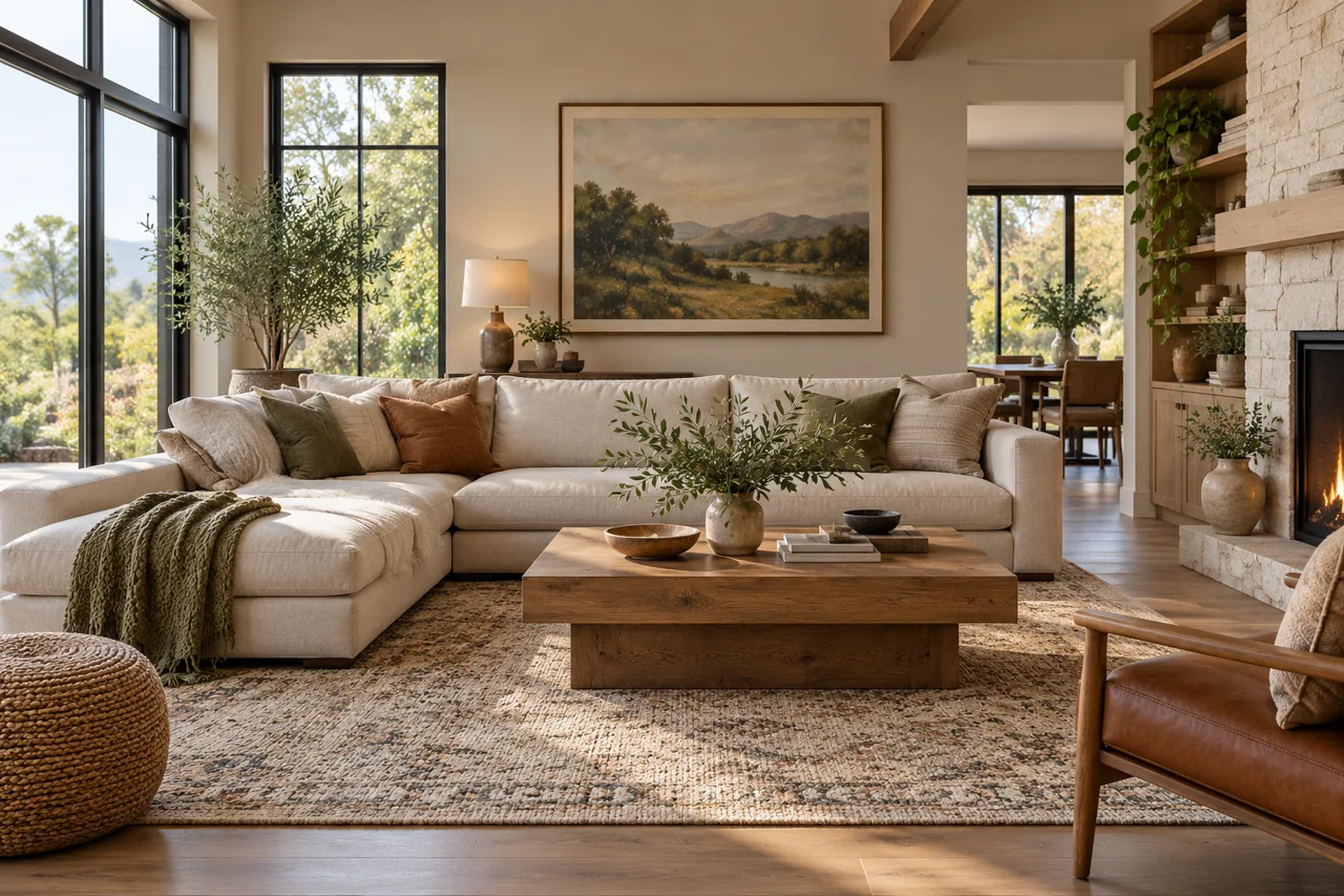
Emphasis gives a room a visual priority. A fireplace, a view, artwork, or a furniture grouping can provide that focus. You do not need to install a new feature simply because the room lacks a traditional focal point.
Look at what catches your eye first. If it is a cable bundle, a bright storage box, or an overcrowded shelf, emphasis has developed accidentally. You can redirect it with placement, light, contrast, or a simpler background.
Use one main focus per view
A room can have several interesting areas without making them compete equally. Consider the main view from the doorway, then the view from seating. Different positions can have different priorities.
If the television and fireplace compete, try relating them through the furniture arrangement or reducing clutter around one. Avoid adding a third dramatic feature before resolving the first two.
Make supporting objects quieter
Not every accessory needs a striking color or unusual shape. Smaller, quieter details help the main feature stand out. Empty wall space can support emphasis just as effectively as a carefully selected object.
5. Rhythm and repetition: create visual connections
Rhythm describes how recurring elements lead the eye through a composition. Repeat a color, material, line, or shape in different areas. A wood tone appearing in a table, frame, and shelf can create a connection without requiring a matching furniture set.
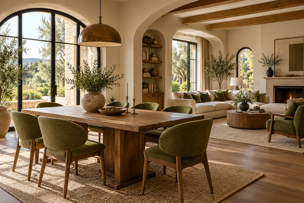
Repetition works best when it includes variation. Identical objects repeated everywhere can feel mechanical. Similar forms at different sizes often create a more relaxed connection.
Repeat a detail with a reason
Choose something already present in a major item, such as a rug or artwork. Echo it in a smaller detail elsewhere. This helps a new purchase feel connected to the room rather than isolated.
For example, a curved lamp can relate to a round mirror, while a textile introduces a softer version of the same shape. The connection remains visible without making every surface identical.
Use rhythm across connected rooms
A shared wood tone, wall color, or hardware finish can connect an entry, living room, and dining area. Each room can still have its own mood. Our interior design aesthetics guide explains how to combine styles without making every room a copy.
6. Contrast: create useful difference
Contrast makes differences visible. Light beside dark is one example, but smooth beside rough, straight beside curved, and quiet beside patterned can also create interest. A room with no contrast may feel flat; a room with constant contrast may feel restless.
Choose where contrast helps the room. A dark frame can define artwork on a pale wall. A textured throw can soften a smooth sofa without adding another strong color.
Control the amount and location
Start with one clear contrast and repeat it selectively. If the room already contains strong flooring, patterned curtains, and colorful art, quieter upholstery may help organize the composition.
Contrast also affects practical visibility. An object can be difficult to distinguish against a similar background. Consider the needs of the people using the room when choosing edges, handles, and frequently used items.
7. Unity and harmony: connect the whole room
Unity means the room feels connected. Harmony describes compatible relationships among its parts. Neither requires everything to match, and neither prevents you from keeping a distinctive inherited piece.
Use a limited set of recurring choices as a framework. A room might combine different furniture periods through warm wood, restrained upholstery, and repeated blue accents. The differences become easier to understand because the background has consistency.
Keep enough variety
Matching every item can make a room feel impersonal. Add variety through a handmade object, a different texture, or meaningful artwork. The aim is a relationship between pieces, not a catalog collection.
Unity also develops through editing. If one item repeatedly feels disconnected, try moving it to another room before replacing it. A useful object may simply need a different context.
Apply the principles together
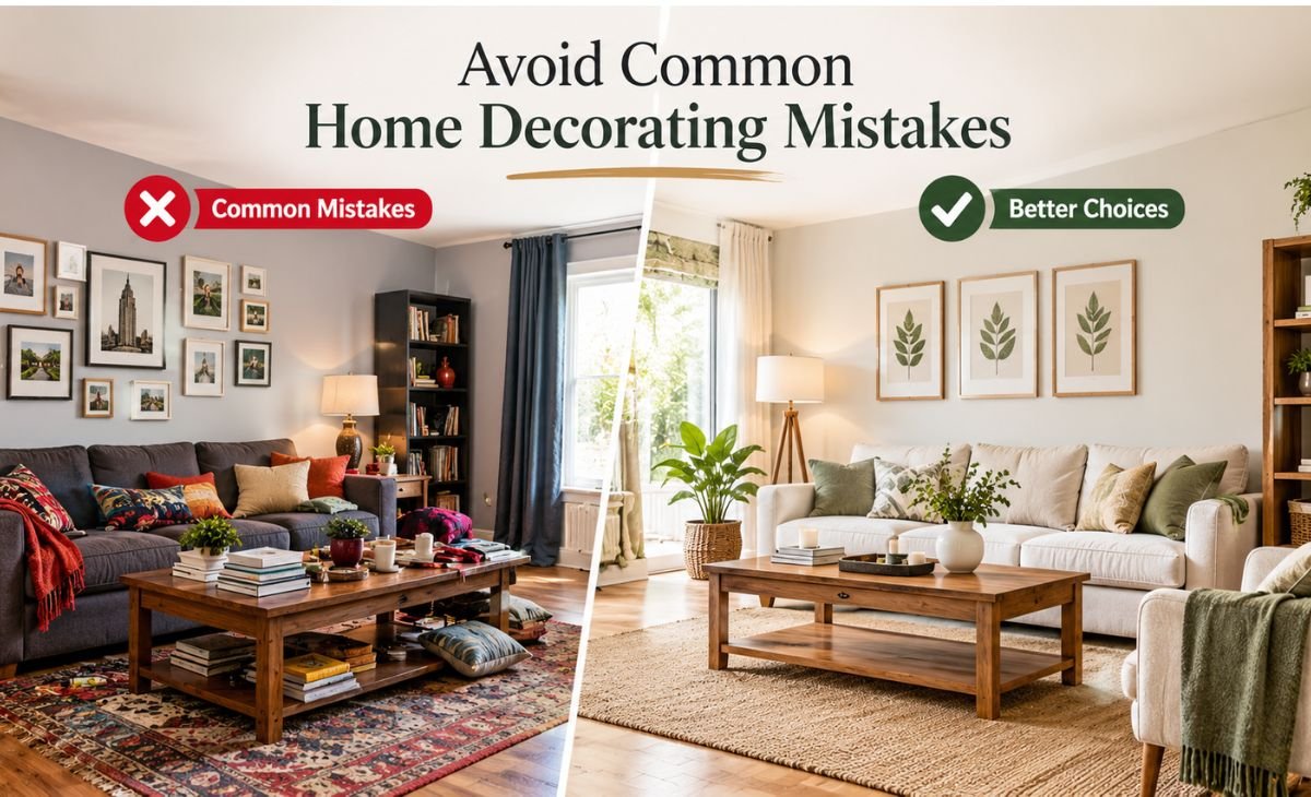
Imagine a living room with a large dark sofa, several tiny pictures, and a bright patterned chair near the doorway. The room feels unsettled even though each purchase seemed attractive. This is an illustrative decorating exercise, not a client case study.
First, identify emphasis. If the chair grabs attention for no useful reason, move it into the seating group. Next, combine the small pictures into a single arrangement so their shared scale relates more clearly to the sofa.
Then repeat one color from the chair in a small detail elsewhere. Finally, remove unrelated accessories around the artwork. You have adjusted emphasis, scale, rhythm, and unity without replacing the main furniture.
| If the room feels… | Check this relationship | Try this first |
|---|---|---|
| Heavy on one side | Balance | Move or remove a visually dense object |
| Awkward despite fitting | Scale and proportion | Compare the largest and smallest pieces |
| Busy everywhere | Emphasis | Choose one focus and simplify its background |
| Disconnected | Rhythm and unity | Repeat an existing color or material |
| Flat or cold | Contrast and texture | Add a different surface quality |
| Attractive but inconvenient | Function and planning | Test the routes and furniture operation |
A practical room review you can do today
Take photographs from the doorway and your usual seat. Photos can reveal relationships you stop noticing in daily life. However, do not let a wide-angle image replace your experience of the real room.
Write down one problem, such as “the art feels too small” or “the desk dominates the seating area.” Name the principle involved and try a reversible change. Live with the adjustment before deciding it requires a purchase.
If you want to compare alternatives digitally, our interior design software guide can help you choose a suitable tool. Keep furniture dimensions accurate so the experiment remains useful.
Use principles without turning them into restrictions
Decorating principles are tools for judgment, not permission slips. A room can deliberately use imbalance, unusual proportions, or strong contrast. What matters is whether the decision supports the intended effect and the people living there.
Avoid treating a fashionable room as proof that every object in it belongs in yours. Use our interior design trends news guide to evaluate changing ideas. For choices about keeping, repairing, and buying materials, see sustainable interior design.
Frequently asked questions
Which principle should a beginner use first?
Start with the problem you can describe most clearly. Balance helps when one side feels heavy; scale helps when furniture looks awkward; emphasis helps when everything competes. You do not need to apply every principle at once.
Are symmetry and balance the same thing?
No. Symmetry is one way to create balance. Different objects can also balance one another through their size, shape, color, and placement. An arrangement does not need matching pairs to feel settled.
Can these principles work with a small budget?
Yes. Moving furniture, grouping existing artwork, editing accessories, and repeating a color can change visual relationships without major spending. Measure and test first so a purchase addresses a real problem.
Improve one relationship at a time
Choose one room and identify its strongest source of visual friction. Make a small adjustment, then evaluate it from several viewpoints. A connected, comfortable room usually comes from a series of considered decisions rather than a single perfect purchase.
5 thoughts on “Principles of Interior Design: A Practical Guide for Your Home”