
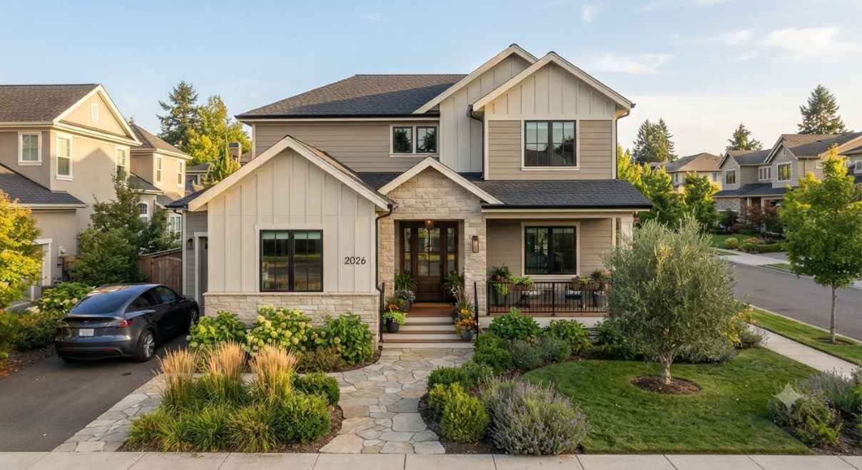

Warm white exterior paint colors: quick answer
The best warm white exterior paint colors for your home are the ones that work with the parts you are keeping: the roof, brick, stone, paving, window frames, and landscape. Start with a short list—such as Benjamin Moore White Dove OC-17, Sherwin-Williams Alabaster SW 7008, and Benjamin Moore Swiss Coffee OC-45—then compare real samples on the actual siding. A tiny paint chip or a phone screen cannot show exactly how a large wall will look beside your roof in morning shade and afternoon sun.
This guide compares 10 widely available U.S. color options, explains how their undertones can shift outdoors, and gives you a practical way to choose. Brand names and online swatches are starting points, not guarantees. Verify the exact color code and coating with the manufacturer or local paint store before placing an order, especially when your surface is vinyl, masonry, stucco, or an existing painted finish.
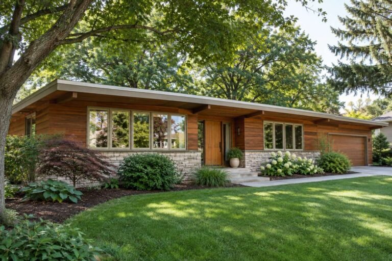
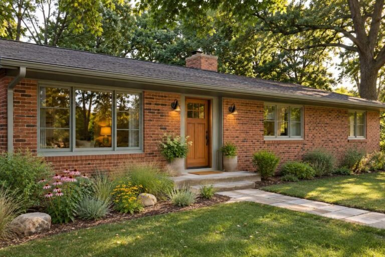
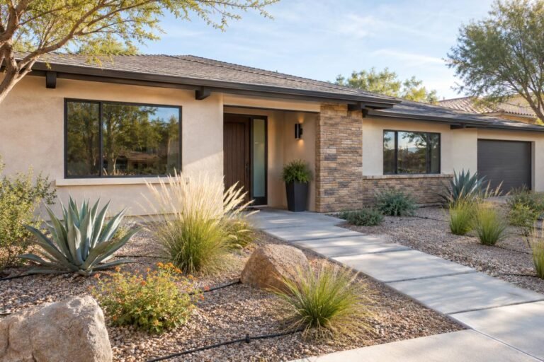
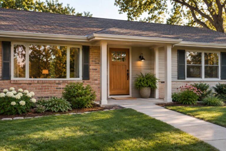
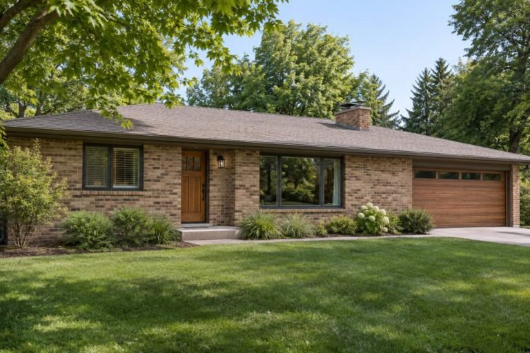
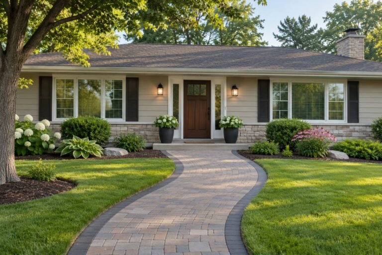
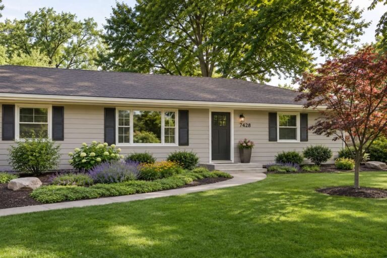
Images in this article show exterior and material examples from the site’s existing media library; they are not verified manufacturer swatches or claims that a pictured property uses a named paint formula. Always use physical samples to decide color.
What makes a white paint look warm outdoors?
“Warm white” is a visual description, not one formula shared across brands. Yellow, red, beige, or sometimes muted green undertones can make a white feel softer than a blue-gray white. Two shades that look nearly identical on a card may separate on a wall: one can read clean and neutral while the other looks creamy. The surrounding color matters just as much—the sky, trees, brick, roof, trim, and paving all affect how your eyes read the paint.
Light Reflectance Value, or LRV, is separate from undertone. It describes the amount of visible light a color reflects, usually on a scale from 0 to 100; it does not tell you whether the color is yellow, gray, or pink, and it is not a measure of durability. Benjamin Moore lists White Dove OC-17 at LRV 83.16 on its current color page. Check the manufacturer’s own page for any LRV you plan to use: third-party charts sometimes round values or mix color lines.
Scale and surface change the impression. A color that seems subtle on a small card can look brighter across an entire sunny facade. A textured surface creates tiny shadows that may make the same color appear deeper than it does on smooth siding. Warm brick can make a neighboring white feel cooler by contrast; dark green trees can reflect color onto shaded walls. These are reasons to test at home, not rules that predict every result.
10 warm white exterior paint colors to sample
These choices cover the competitor’s eight shades plus two additional options. The list includes clean warm whites, creamier colors, muted off-whites, and one cooler boundary shade. Brand descriptions are starting points; sample the actual paint on your surface before choosing.
1. Benjamin Moore White Dove OC-17
White Dove is a clean, classic white with restrained warmth. Benjamin Moore lists its current LRV at 83.16. Treat that as a comparison point, not a prediction: brick, roof color, shade, and the size of the painted surface still change what you see. Try it on traditional, Colonial, Cape Cod, Craftsman, or transitional homes, and compare it with the trim at the actual window edge. View White Dove OC-17.
2. Sherwin-Williams Alabaster SW 7008
Sherwin-Williams describes Alabaster as a soft, warm, balanced white. It can be a good starting point beside warm wood, tan stone, or leafy landscaping. Check both a sunny and shaded elevation so you can see whether its warmth becomes stronger in golden light. Compare it with a cleaner trim shade if you want the facade to look crisp. View Alabaster SW 7008.
3. Sherwin-Williams Creamy SW 7012
Creamy is a more visibly warm choice for a homeowner seeking a cream rather than a subtle warm white. Compare it with Alabaster and White Dove beside the same brick or roof, especially if the facade receives strong afternoon sun. The color can look more yellow at full scale than on a small card. Check product suitability for the surface before ordering. See the manufacturer’s Creamy SW 7012 color page.
4. Benjamin Moore Swiss Coffee OC-45
Swiss Coffee is a creamy off-white to compare when a clean white feels cold but a tan feels too dark. The name also appears in other brands, with different formulas; always give the brand and code. Try it beside red or brown brick, but compare a cleaner option if you have charcoal shingles or cool gray stone. View Swiss Coffee OC-45.
5. Sherwin-Williams White Duck SW 7010
White Duck is a muted white that can lean toward cream or greige depending on light and surroundings. It is worth sampling when a bright white seems too sharp beside stone or mature trees. Compare its appearance in full sun and deep shade, then judge from the street. View White Duck SW 7010.
6. Benjamin Moore Cloud White OC-130
Cloud White is a soft, light option for a cleaner look than a strong cream. Compare it with White Dove at the same trim edge: a subtle undertone difference can become obvious when the colors meet. Against golden wood or creamy brick, check that it does not feel too cool by contrast. See Benjamin Moore’s current Cloud White OC-130 details.
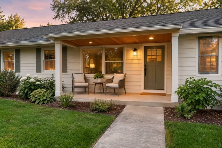
7. Sherwin-Williams Shoji White SW 7042
Shoji White is a muted off-white candidate when bright white looks sharp and cream looks too yellow. It can sit comfortably in a neutral, stone-centered palette, but its appearance shifts with sun and shade. Test a shaded wall and a sunny wall before deciding. View Shoji White SW 7042.
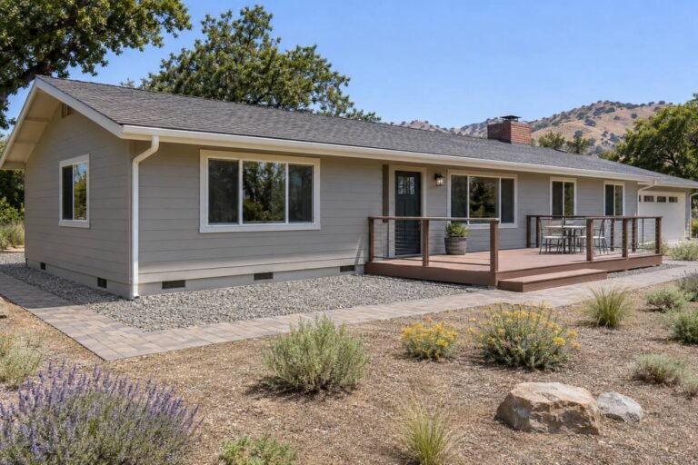
8. Benjamin Moore China White OC-141
Use China White as a cooler boundary comparison, not an assumed cream. It can help you decide whether the roof or stone calls for a more neutral off-white. Place it beside Alabaster or Swiss Coffee on the same wall; if it looks flat in deep shade, a warmer option may fit better. Benjamin Moore describes China White OC-141 as a white with cool gray undertones.
9. Sherwin-Williams Greek Villa SW 7551
Greek Villa is an additional soft-white sample to compare with White Dove. Test it near pale stone, wood, and window frames, then view it from across the street. A color that feels subtle on a chip may dominate across siding, garage doors, and fascia. Check the official Greek Villa SW 7551 page.
10. Sherwin-Williams Natural Choice SW 7011
Natural Choice can bridge a clean white and a beige-leaning off-white. It helps reveal which direction you prefer, even if it is not the final selection. If it feels too muted, compare White Dove; if too crisp, compare Creamy. Keep the initial shortlist to three or four choices. See the official Natural Choice SW 7011 page.
Warm white, cream, or off-white: choose the right family
Use warm white when you want the house to read mostly white, but with less of a cold or clinical impression. Choose cream when you want a visibly warmer facade and the roof, masonry, paving, or wood also support that warmth. Choose a muted off-white when gray stone, charcoal shingles, or heavy shade makes a creamy sample look too yellow. These categories overlap; the real sample on your home matters more than the label.
LRV can help you compare relative lightness, but it is not a ranking of quality. A high LRV shade may look bright under direct sun; a more muted color may have more visual depth. Read the manufacturer’s current value when available, then judge the actual hue on your material. LRV does not tell you whether a paint will resist mildew, what sheen suits a substrate, or whether it is approved for vinyl siding.
| Family | Visual direction | Try comparing |
|---|---|---|
| Cleaner warm white | White first, restrained warmth | White Dove vs. Alabaster |
| Creamier white | More obvious warmth, softer contrast | Creamy vs. Swiss Coffee |
| Muted off-white | Quiet, less bright, may lean neutral | White Duck vs. Shoji White |
| Cooler boundary sample | Can test whether warmth is needed | China White beside a warm white |
Match paint to the materials that are staying
Before choosing paint, list the fixed materials: roof, brick, stone, concrete, pavers, window frames, metalwork, and any large area of wood. Photograph them in daylight. Include mature planting that sits close to the walls, because green foliage can reflect color onto shaded siding. A sample that looks perfect alone may clash beside a red-orange brick, purple-brown roof, or blue-gray stone.
For red or brown brick, test warm and cleaner whites beside both the brick face and the mortar. For gray stone or charcoal shingles, add a cleaner white and a muted off-white to your first shortlist. For cedar or warm timber, compare a neutral warm white with a cream; a yellowish pairing can make the entire facade feel too golden. You do not have to match every undertone exactly, but body, trim, roof, and masonry need enough harmony and separation to read as one home.
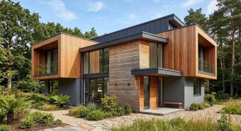
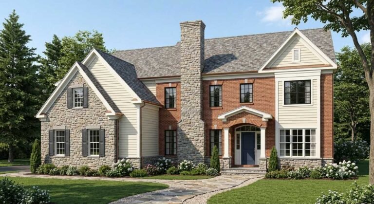
Brick and stone are fixed colors, not blank backgrounds. If you are choosing a warm white for painted siding beside masonry, place samples where the siding and masonry meet and compare the mortar as well as the stone face. This makes it easier to see whether the sample leans too yellow, pink, or gray.
A color scheme should respond to the architecture too. A simple ranch or modern farmhouse may look balanced with a body shade, trim shade, and one accent; a detailed Victorian or Craftsman can have more trim distinctions if those features are already part of the structure. For related planning, read our exterior wall materials guide and modern ranch house exterior ideas.Build a body, trim, and accent palette
Choose the body color first, then decide whether trim should blend, frame, or contrast with it. Add one accent for a door or shutter after the fixed colors are known. Sample body and trim together where they meet; independently attractive whites can clash when adjacent.
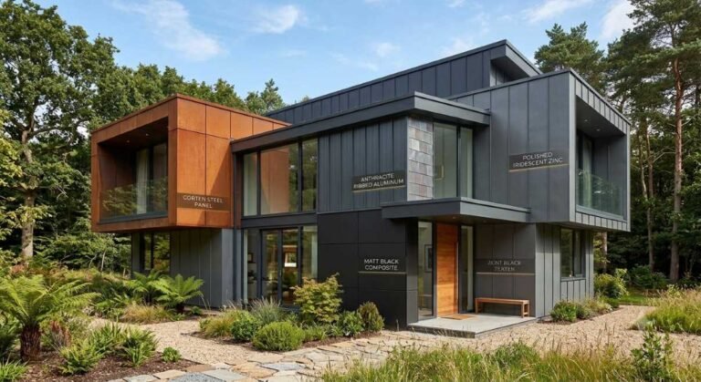
Soft white trim for a quiet look
Trim close to the body creates a calm facade and keeps attention on architecture and landscaping. The risk is that nearly identical values can make windows disappear. Test a visible edge from the street and confirm that the paint is intended for the trim surface.
Dark trim for definition
Charcoal, deep bronze, or black can frame windows and modernize warm-white siding. Check the contrast against roofing, garage doors, and porch fixtures. For vinyl or heat-sensitive siding, verify color limits and product compatibility before using a dark shade.
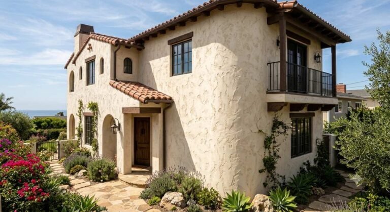
Wood and muted accents
Natural wood, copper-tone fixtures, muted green, and smoky blue can complement warm white when their undertones suit the roof and landscape. Keep brighter colors to a smaller area unless the architecture supports more. For door and trim context, see our exterior trim materials guide.
Sunlight and shade change the result
In the United States, north-facing walls often receive cooler indirect light, while south- and west-facing walls may get longer direct sun. Trees, porches, overhangs, and nearby buildings can matter just as much as compass direction. Use orientation as a reason to test multiple places, not as a rigid recipe for choosing a color.

Check samples in morning, mid-afternoon, and near sunset, in both sun and shade. View from the street and close up: distance can make pale paint look brighter and reduce the visibility of subtle trim contrast. Camera and screen settings also shift white balance, so photos are not reliable color matches.
Benjamin Moore recommends viewing samples throughout the day and notes that screen color may differ from actual paint. For broader style context, read our exterior 2026 design trends guide, then make the final choice for your own home.
A practical sample-testing plan
A tiny card under store lighting cannot predict how a large exterior wall will look. Use a sample method approved by the manufacturer for the surface and product, and follow its instructions for preparation and drying. Compare three or four options rather than covering the house with unrelated swatches.
- Include one cleaner warm white, one creamier option, and one muted off-white.
- Use comparable boards or approved test areas with the same surface and base condition. Label every sample with brand, code, product, finish, and location.
- Place samples beside roof, brick, stone, trim, and windows so the fixed colors are present.
- Review morning, afternoon, evening, sun, and shade; view from the sidewalk as well as up close.
- After narrowing to one or two, test the body and trim together at the actual boundary.
- Before ordering, confirm surface compatibility, product, finish, coverage, primer, and current application directions.
Benjamin Moore advises viewing samples from morning to evening and notes that screen colors may differ. A larger mock-up helps you judge undertone and scale, but follow the sample-product directions and your painter’s advice. If photographing samples, keep exposure consistent, avoid filters, and record the exact color codes.
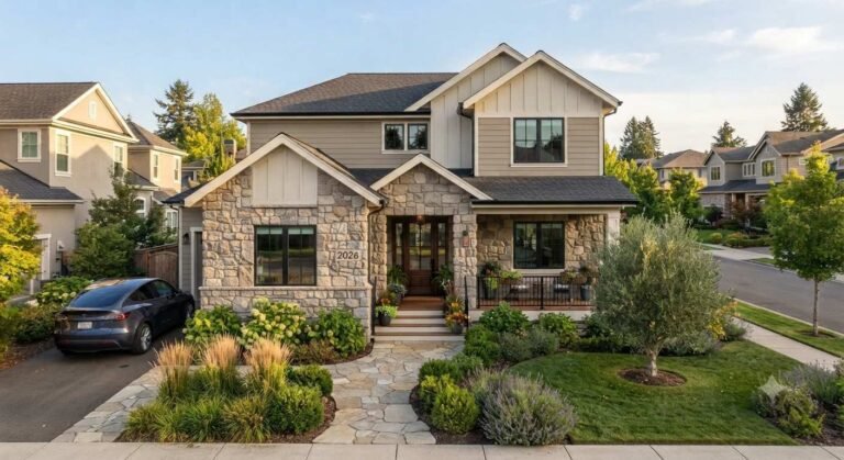

Choose a compatible exterior product for each surface
“Exterior paint” is not one interchangeable coating. Wood, fiber cement, vinyl, stucco, brick, masonry, and metal may need different preparation and product instructions. Identify what the wall is made from and what coating is already there. Look for peeling paint, chalking, loose caulk, moisture intrusion, failing mortar, mildew, or damaged siding. A new color cannot correct an unsound surface, and applying paint over moisture or loose coating can lead to early failure.
Ask the manufacturer or a qualified painter whether the selected product is intended for your exact substrate and exposure. Follow the label for cleaning, scraping, sanding, patching, primer, temperature, humidity, number of coats, and curing. Do not assume every exterior needs the same primer or sheen; the right system depends on the surface, existing finish, and product line. For more context, review our exterior window trim material guide.
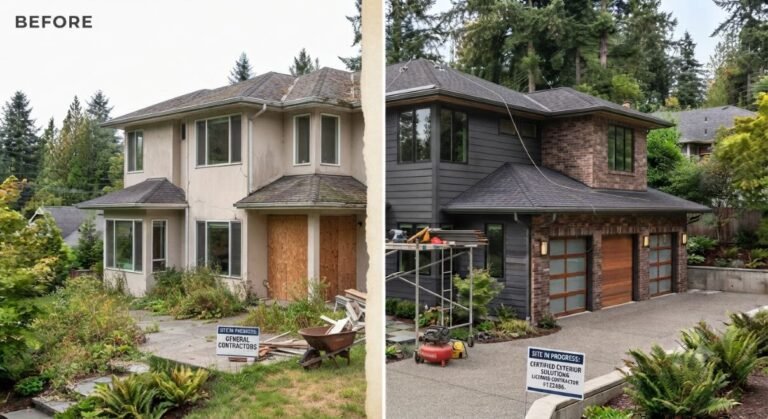
If the house was built before 1978 in the United States, disturbing painted surfaces may involve lead-based paint. Review the U.S. Environmental Protection Agency’s Renovation, Repair and Painting program and use a certified firm when the rule applies. When you do not know the coating’s age or condition, get qualified advice before scraping or sanding.
Texture changes the test. A smooth board may not predict how the same color will look on rough stucco, weathered wood, or fiber cement with visible grain. If the home has more than one painted material, sample on each representative surface or ask the painter to prepare a mock-up. Record whether the existing finish is glossy, chalky, or stained, because a primer or different preparation may be needed before the new coating can adhere. Do not use an online color preview to decide whether a coating is suitable for masonry, vinyl, or metal; check the product label for approved surfaces.
Sheen, dirt, and maintenance
There is no one exterior sheen for every siding. Glossier coatings can highlight surface irregularities; flatter finishes may be harder to clean in some conditions. Check the specific product’s finish choices and substrate directions rather than relying on a universal online rule.
Light exteriors still collect dust, pollen, and organic growth. Tree cover, roof runoff, moisture, and surface texture influence dirt visibility as much as undertone. Ask the manufacturer how to clean the selected product and keep gutters, downspouts, and drainage working. Confirm that the coating is suitable for your region and the temperatures expected during application; verify color limits for vinyl and heat-sensitive materials.
HOA, historic district, and neighbor checks
Before buying large samples or setting a start date, check whether an HOA, condo association, historic district, landlord, or preservation office regulates exterior colors. Some require written approval, an approved palette, or review of the body, trim, and front door together. Save permission in writing and ask whether a manufacturer color code is required; the phrase “warm white” may not be precise enough for a review committee.
Use nearby homes as context, not as proof that a shade will work at your address. Their roof, porch orientation, shade, and siding may be different. If your home is in a historic district, ask which colors and paint systems are permitted before ordering materials. Handling these questions early can prevent a paint purchase or schedule from being wasted.
Quick shade decision guide
| Home condition | First colors to sample | What to compare |
|---|---|---|
| Warm red brick, tan stone, cedar | Alabaster, Swiss Coffee, Creamy | How much warmth the fixed materials already have |
| Charcoal roof, cool gray stone, dark windows | White Dove, Cloud White, China White | Clean contrast versus yellow undertone |
| Deep shade or mature trees | White Dove, Alabaster, White Duck | Brightness and warmth without a muddy look |
| Strong direct sun on a broad wall | White Dove, Cloud White, Shoji White | Glare, brightness, and midday color shift |
| You want a noticeable cream | Creamy, Swiss Coffee, White Duck | Whether cream suits brick, roof, and wood |
Treat this chart as a starting point, not a prescription. If your preferred paint looks wrong on the actual wall, remove it from the shortlist even if an online article recommends it.
Frequently asked questions
What is the best warm white exterior paint color?
There is no universal best. White Dove, Alabaster, Swiss Coffee, and Creamy are useful first samples, but the right choice depends on your roof, brick, stone, siding, windows, and outdoor light.
Should exterior trim match the body color?
It can match for a quiet palette, contrast for definition, or sit between those approaches. Compare body and trim samples together where they will meet.
Will warm white paint look yellow outdoors?
Some shades can, especially in strong warm sunlight. Others may look gray in deep shade. Check samples on more than one elevation and at different times of day.
Can I choose from an online photo?
Use photos for inspiration, not color matching. Screens and camera processing alter white balance. Use the manufacturer’s color code and a physical sample.
Which warm white goes with red brick?
Compare White Dove, Alabaster, Swiss Coffee, and a muted option beside both the brick and mortar. The roof and window colors affect the result too.
Is warm white suitable for a sunny climate?
It can suit the design, but product performance depends on the coating and wall assembly. Confirm product directions and test for glare and undertone in direct sun.
How many exterior colors should I use?
Many homes work with body, trim, and one accent. Architecture and local guidelines should determine whether additional colors are useful.
Can I use my interior white outside?
Do not assume so. Verify that the specific product is made for the exterior substrate and exposure, even if the color name is the same.
What should I ask a painter?
Confirm surface preparation, repair work, primer, product, finish, number of coats, application conditions, cleanup, and the exact color code on the written estimate.
Final takeaway
The best warm white exterior paint colors are the ones that respect your home’s permanent materials and real light. Start with three or four samples, compare undertones, verify each brand’s code and product directions, and test on a representative surface before buying the full quantity. White Dove, Alabaster, Creamy, Swiss Coffee, White Duck, Cloud White, Shoji White, China White, Greek Villa, and Natural Choice give you a useful range from cleaner white to creamier off-white—but the sample at your own home makes the decision.
For a wider exterior plan, explore the 2026 exterior design trends guide, exterior wall materials guide, and modern ranch house exterior ideas. Together, these pages help connect paint, material choices, and overall curb appeal.
Color and safety references
Check current manufacturer details before purchasing: White Dove OC-17, Swiss Coffee OC-45, Alabaster SW 7008, White Duck SW 7010, Shoji White SW 7042, and Benjamin Moore sample guidance. For pre-1978 homes, review the EPA RRP program before disturbing old coatings.
2 thoughts on “Warm White Exterior Paint Colors: 10 Shades, Pairings & How to Choose”