

Brown interior design works best when you treat brown as a family of colors and materials rather than one flat shade. Walnut, chocolate, camel, tobacco, taupe, and reddish timber can look very different together. Decide which brown will lead, then use contrast and texture to keep the room readable.
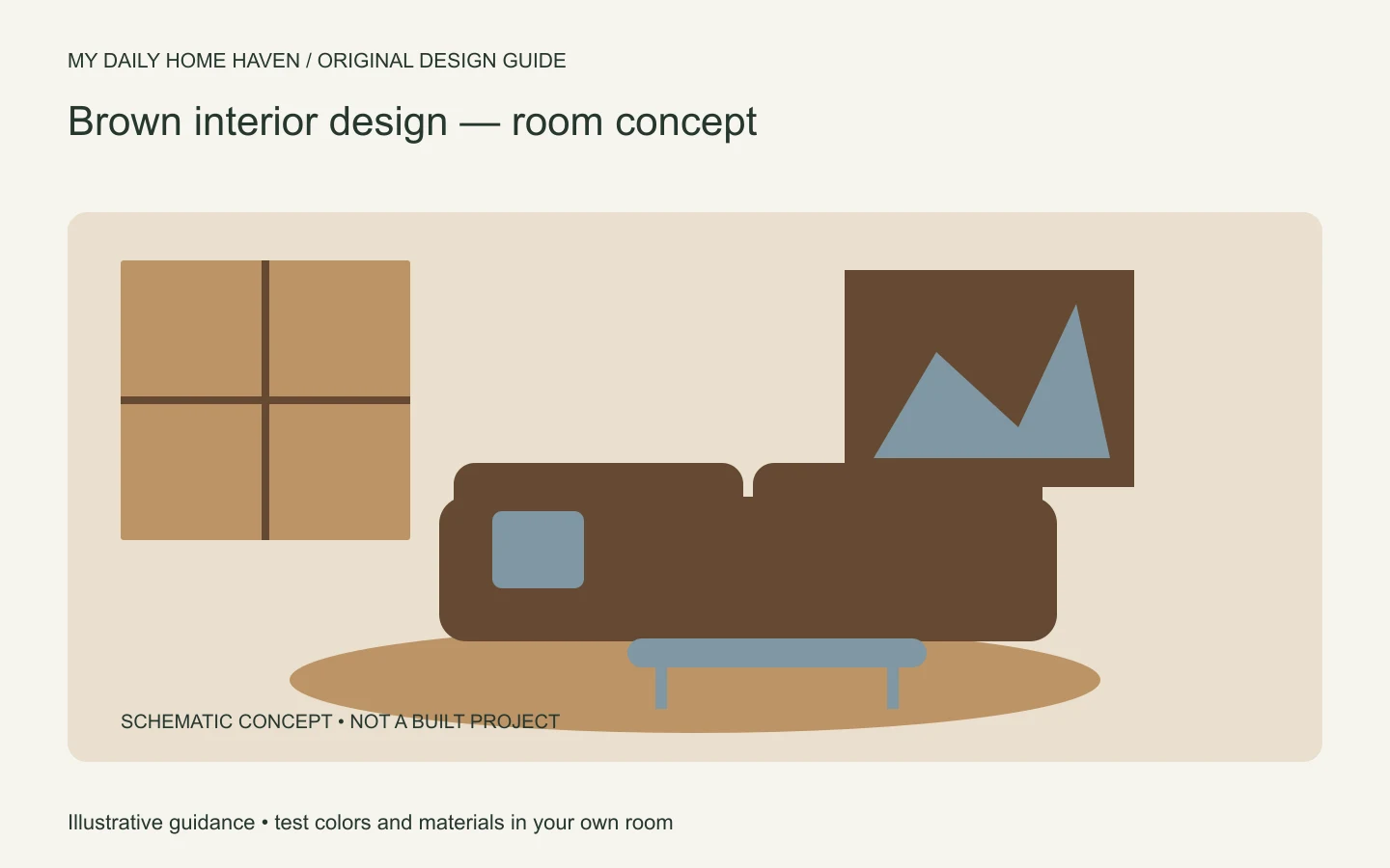
Brown can support a contemporary, traditional, rustic, or colorful home. This guide focuses on coordinating its variations, especially when you already have wood floors or large brown furniture. For the wider style choices, see our interior design aesthetics guide.
Brown Interior Design: Build Contrast into the Palette
Brown interior design can feel warm or heavy depending on undertone, light, and surface area. Compare paint and wood samples in both daylight and evening light, then pair deeper browns with a lighter wall, reflective surface, or soft textile. Keep the strongest shade on a limited number of elements until you know how the room reads at different times.
Identify the brown you are starting with
Look at the largest brown element in the room. Is it a cool dark floor, a golden oak cabinet, a red-toned leather sofa, or a soft taupe carpet? These starting points call for different supporting colors. Calling them all brown can hide the differences that matter.
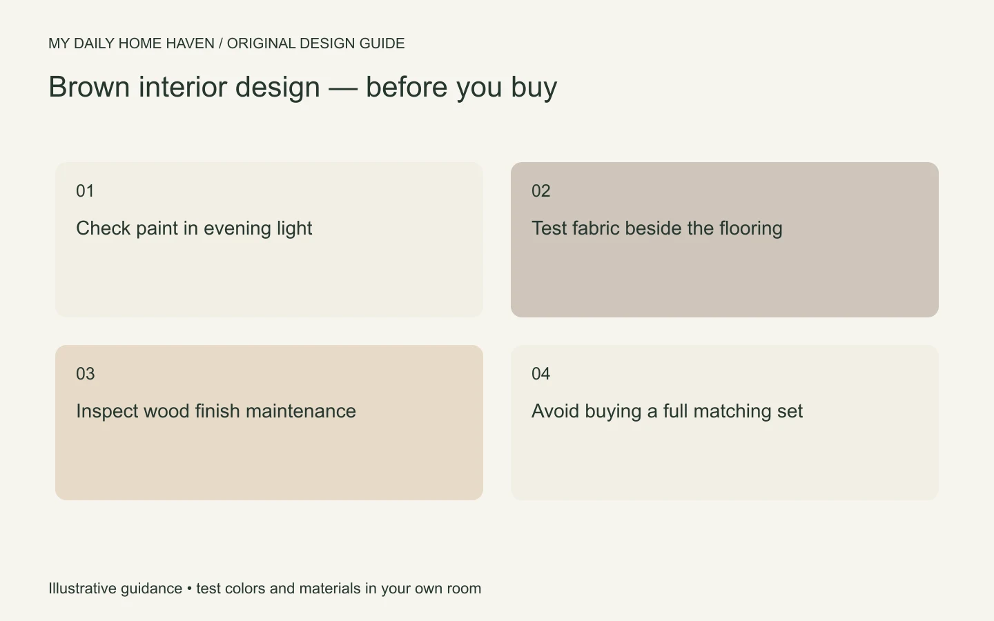
Place samples beside the existing finish rather than judging each item alone. A new wood table can look neutral in a shop and noticeably orange next to your floor. Compare both the main color and the visible grain or pattern.
You do not need identical woods. A deliberate difference can look better than an almost-match. Repeat a related tone elsewhere in the room if the mix feels disconnected, and avoid introducing many additional woods without a clear role.
Give dark brown a specific job
A dark brown sofa can anchor a pale room. Dark walls can create an enveloping backdrop. A dark table can outline a lighter seating group. Problems often arise when all three compete in a small space without enough difference in value or texture.
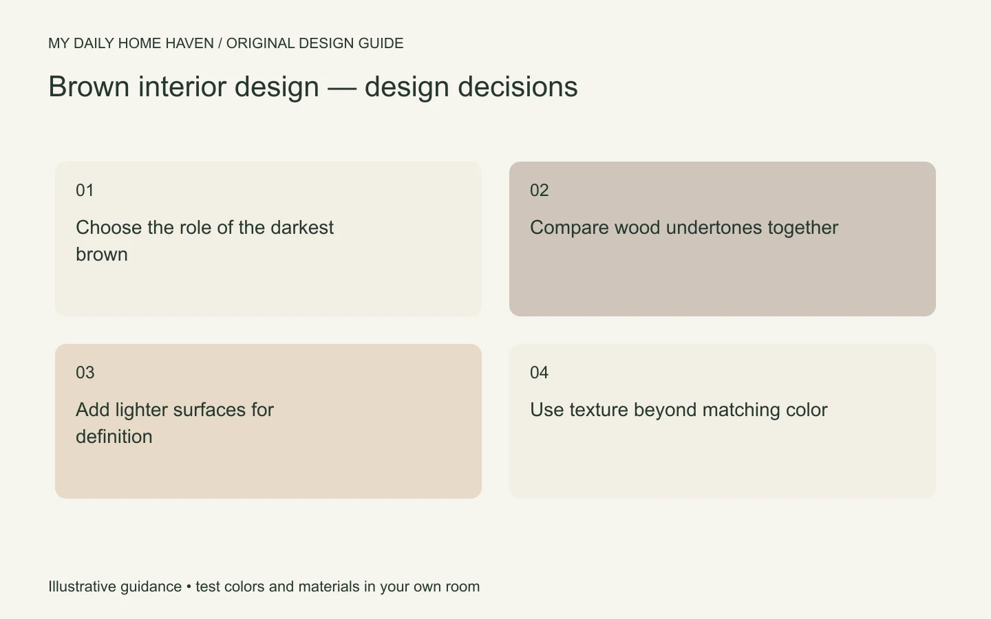
Choose one main dark area first. Add lighter upholstery, curtains, or a rug where needed to separate adjacent surfaces. If you prefer a largely dark room, use lighting and material changes so the furniture does not disappear against the walls.
Do not assume brown paint will solve a room that lacks light. Paint changes the surface color; the lighting plan still needs to serve reading, conversation, and movement. Test the proposed shade under the lamps you will actually use.
Choose companion colors deliberately
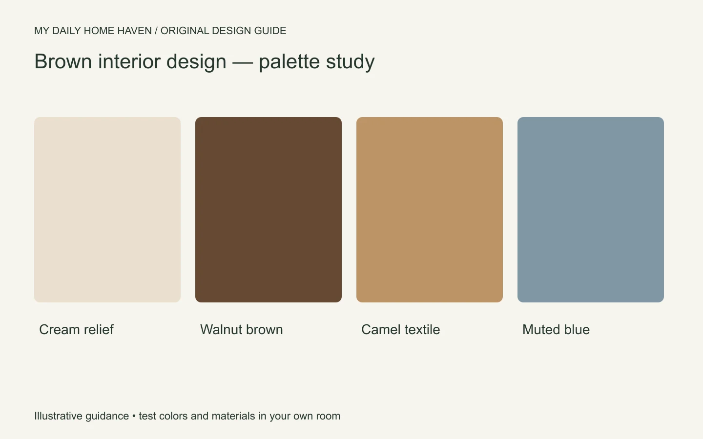
Cream and warm white can provide relief, but compare them against the brown rather than picking a favorite white in isolation. Some whites may look too yellow beside golden wood; others can appear stark beside a soft camel fabric.
Muted blue, green, dusty pink, and deep red can all work as accents in suitable proportions. Choose one direction and test it through a smaller item first. You may need only a cushion or artwork rather than a second strong wall color.
Paint undertones also change with surrounding materials and light. Sherwin-Williams explains undertones as part of choosing a hue. Use that guidance to compare samples in the actual room, not as a promise that one undertone works everywhere.
Layer brown through different materials
Brown leather, velvet, woven wool, and timber reflect light differently. Combining them can create depth even within a restrained palette. The aim is variation you can see and feel, not buying every available texture.
A smooth leather chair may pair well with a woven cushion and a matte-finished table. If every surface is glossy, the room may feel hard. If every surface is rough and dark, it may feel visually heavy. Introduce an opposing quality where the scheme needs balance.
Consider maintenance before choosing a finish. Ask how the leather is treated, how the textile should be cleaned, and whether the wood surface shows rings or scratches easily. Dark color alone does not make a material resistant to wear.
Plan around existing brown furniture
If you own a large brown sofa, keep the surrounding choices simple at first. Move it into the best layout, then compare a lighter rug and curtain sample. A better relationship between the sofa and the room may remove the urge to replace it.
Avoid scattering several tiny brown accessories to make the sofa match. Instead, repeat the tone once in a substantial element such as a frame, table, or larger artwork. This creates a clearer connection with less clutter.
Our principles of interior design guide explains how repetition and emphasis help a room feel coherent. You can use those principles without making every item the same color.
A bedroom scheme to test
Imagine a dark wood bed and medium-toned floor. Start with light bedding and a rug that distinguishes the bed from the floor. Use a bedside lamp with a shade that gives useful light, then introduce a muted accent through a throw or artwork.
If you want brown walls, test a large sample behind the headboard and on a wall near the window. Observe the contrast with the wood in both places. A shade that blends too closely may make the bed lose definition; a lighter or more muted brown could work better.
Keep the room practical. Check that bedside surfaces hold what you use and that drawers open freely. A rich palette will not compensate for an awkward daily routine.
Use a sample group
For brown interior design, create a sample group containing the floor reference, the main upholstery, a wall option, and one accent. View the group together instead of approving each material on a different day. If the result feels too similar, change value before changing the entire palette: a lighter rug or darker frame may be enough. If it feels disconnected, look for an undertone that is not repeated elsewhere. Keep the approved samples until deliveries arrive so you can check that the supplied finish matches the version you selected, especially where several wood options are available.
Frequently asked questions
Can I combine brown with gray?
Yes. Compare the actual shades and include a connecting material or textile. A warm gray may relate differently to golden wood than a blue-gray does, so samples matter.
Will brown make a small room feel smaller?
The result depends on value, lighting, contrast, and furniture scale. Test the color and layout rather than treating the size of the room as an automatic ban on brown.
Should all my wood furniture match the floor?
No. Clearly related or deliberately contrasting finishes often work better than uncertain near-matches. Limit the number of competing tones and repeat the most important ones selectively.