

Sage green interior design uses a muted, gray-influenced green as part of the room’s palette. Depending on the shade, it can lean warmer and yellower or cooler and bluer. That variation matters more than the name on the paint card: the right sage should work with your floor, furniture, and light.
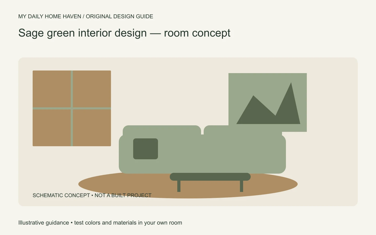
Use it on walls, cabinetry, textiles, or a smaller accent according to the scale of change you want. This guide focuses on practical coordination rather than promises about a color’s effect on health or mood. See our interior design aesthetics guide for the wider style choices.
Sage Green Interior Design: Test the Shade in Place
Sage green interior design changes with daylight, neighboring colors, and the material around it. Test paint samples beside flooring and upholstery at different times of day, then decide whether the shade belongs on walls, cabinetry, or smaller accents. Pair it with a warm neutral or natural wood only after checking that their undertones work together.
Find the sage that fits your fixed finishes
Begin with the elements you are keeping. Golden oak, cool gray tile, reddish timber, and cream stone create different starting points. Place green samples directly beside them so you can compare the relationships rather than judging each color against a white screen.
A warmer sage may relate well to some timber tones, while a cooler one may suit another room. There is no universal pairing rule. The surrounding colors can make an undertone appear stronger or quieter than it did on the sample card.
Sherwin-Williams explains paint undertones and the influence of lighting. Use a large sample in your own room before choosing all the curtains, cushions, and accessories to match.
Decide how much green the room needs
Sage walls create a different effect from a sage sofa against pale walls. Cabinets make a more permanent material commitment than a washable cushion cover. Choose the surface according to your budget, maintenance needs, and willingness to change it later.
If you are uncertain, start with a textile or artwork. This lets you assess whether you enjoy the color beside your existing furniture. It also gives a rental home a reversible option without needing to repaint.
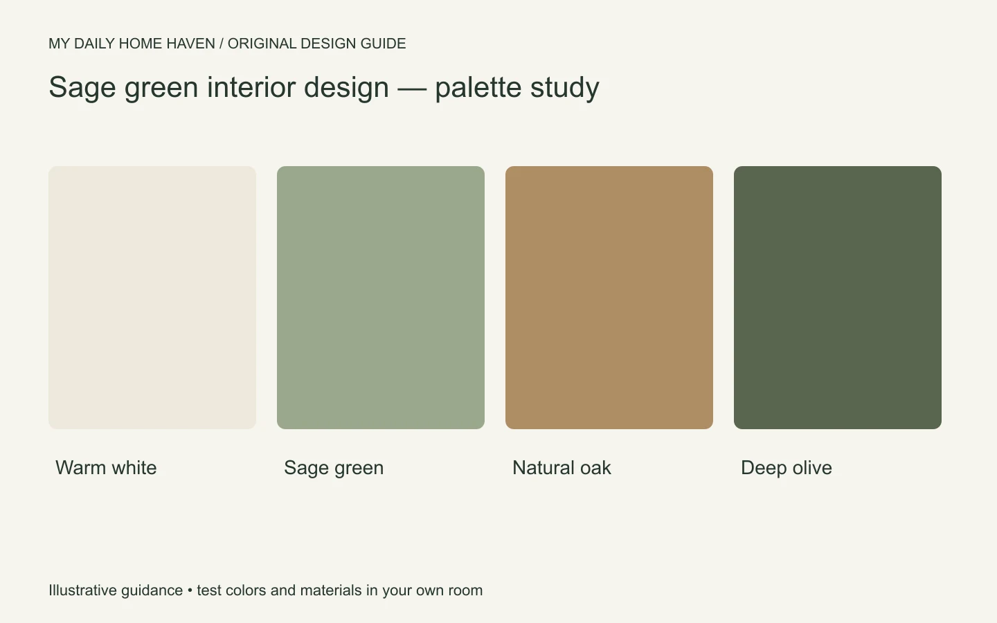
For a full-room scheme, keep some variation in value. A pale ceiling, deeper wood, or darker frame can prevent several similar sage surfaces from blending into one indistinct field. You do not need a strong contrasting color on every item.
Build a coordinated palette
| Supporting color or material | What it can contribute | What to test |
|---|---|---|
| Warm white | A lighter background | Whether it looks yellow beside the green |
| Timber | Grain and warmth | Red, orange, or golden undertones |
| Charcoal or deep olive | Definition | Whether the room becomes too heavy |
| Dusty pink or clay | A smaller warm accent | Saturation beside the chosen sage |
Use the table as a sampling plan, not a guaranteed recipe. Choose one direction and compare actual materials together. A small accent can provide enough variation; adding every possible companion color may weaken the scheme.
Texture matters too. A woven sage fabric, painted cabinet, and glossy tile will not look identical even if their colors seem close. Decide whether you want a deliberate material contrast or a quieter relationship before ordering.
Use sage in the living room
With a neutral sofa, sage curtains or a rug can introduce color without requiring new upholstery. Compare the green with the sofa’s undertone and the floor. A beige sofa that leans pink may behave differently from one that leans yellow.
If the walls are sage, use plain upholstery or a controlled pattern to keep the room readable. A darker table or frame can help define the seating group. Leave enough clear surface for normal use rather than filling every gap with coordinating green accessories.
Choose the layout first. A beautiful palette cannot fix furniture that blocks a doorway or makes conversation awkward. Our space planning guide helps test the arrangement before you finalize textiles.
Use sage in bedrooms and kitchens
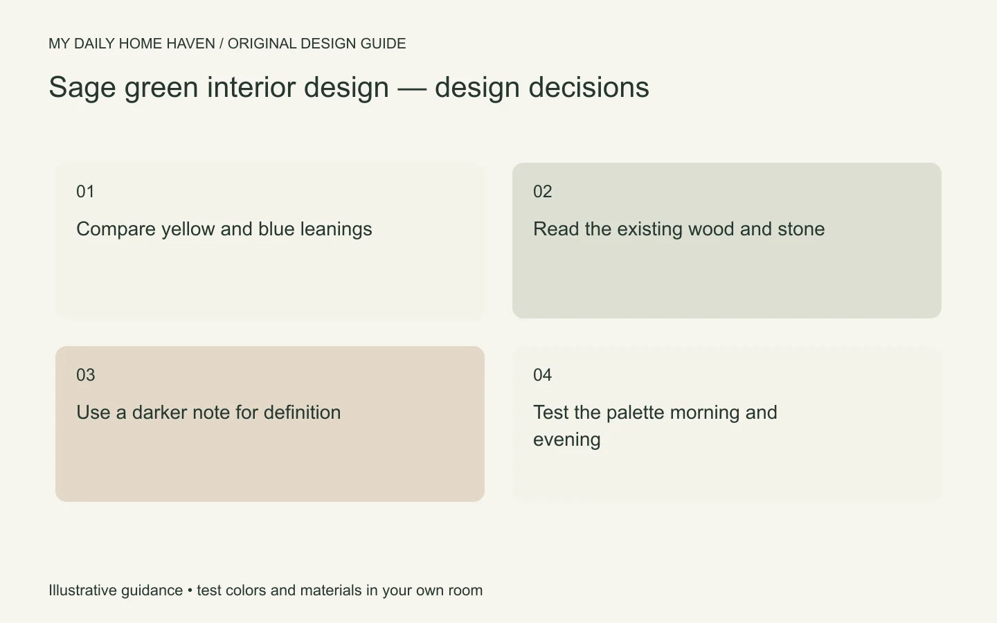
In a bedroom, compare the proposed green with bedding, wood furniture, and evening lighting. The wall behind the bed and the wall near the window may read differently. A large sample you can move makes those differences easier to judge.
In a kitchen, include the countertop, backsplash, floor, and metal finishes in the sample group. Do not choose cabinet color from a single cabinet door viewed away from the room. Check how the finish will be cleaned and whether it is suitable for the existing cabinet material.
Painting cabinets requires proper preparation and a suitable coating system. A color guide cannot tell you whether a particular surface is ready for paint. Follow product instructions or consult an appropriate professional if the existing finish or condition is uncertain.
Test before making the whole commitment
View samples during the hours you use the room: breakfast daylight, afternoon light, and evening lamps if relevant. Compare the green with actual curtain or upholstery samples rather than small printed images. Keep a record of the product, color, and finish you tested.
Once you choose the main shade, resist buying everything in a near-match. Repeat the green selectively and use related neutrals or contrasting materials around it. This usually produces more depth than a collection of slightly different greens competing to match.
If the room feels flat, try changing value, texture, or lighting before introducing another paint color. The missing element may be a darker outline or a more useful lamp rather than a new accent wall.
Check the adjoining room
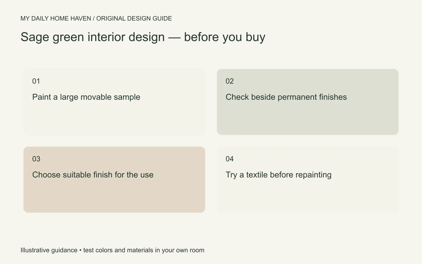
Sage green interior design should also be tested from the spaces that open onto it. Stand in the hallway or adjoining room and compare the proposed green with the colors visible through the doorway. You do not need an identical palette everywhere, but a deliberate transition can help the home feel connected. A shared timber tone or a repeated textile color may provide that connection without repainting the next room. If the green clashes with a fixed finish you cannot change, try another sample before buying the full quantity. The doorway view is part of the scheme too.
Frequently asked questions
Can sage work with gray furniture?
Yes, but compare the actual undertones. A blue-gray sofa and a yellow-leaning sage may need a connecting textile or a different green sample to feel coherent.
Is sage only suitable for country-style rooms?
No. It can work with clean-lined contemporary furniture, traditional pieces, or an eclectic mix. Shape, material, and detailing determine the broader style.
Should the trim be white?
White is one option. Related pale colors or a coordinated deeper tone may also work. Test wall and trim samples together, including the intended sheen, before deciding.