
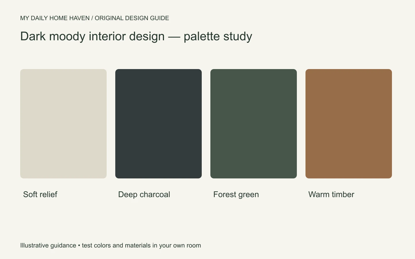
Dark moody interior design uses deep colors, controlled contrast, and layered light to create an enveloping room. Charcoal, deep green, navy, plum, and brown can all work. The important part is making the space usable after sunset, when dark walls and fabrics may absorb much of the available light.
Start with a practical lighting and furniture plan, then choose the palette. A room can feel atmospheric without making reading, cleaning, or finding objects difficult. Our interior design aesthetics guide explains how a moody palette can fit several different styles.
Dark Moody Interior Design: Plan Light Alongside Color
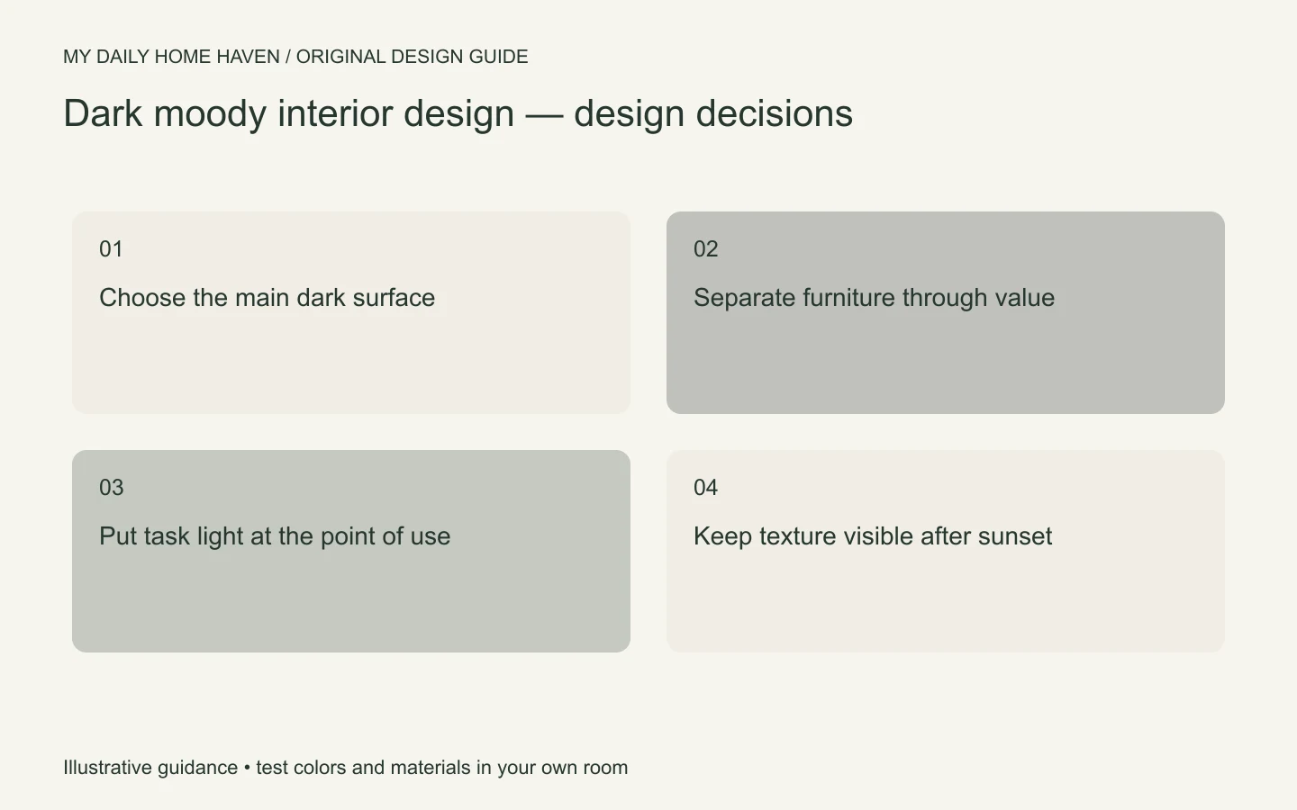
Dark moody interior design can feel intimate when lighting is planned with the paint. Check how the darkest surfaces look in daylight, then layer ambient, task, and accent light for evening use. Retain contrast on trim, textiles, or artwork, and verify that storage and walking paths remain easy to see before committing to a fully dark room.
Decide where the darkness belongs
You might use deep walls with lighter furniture, a dark sofa against pale walls, or a more continuous dark scheme. Each creates a different relationship. Choose the main dark area first rather than buying several dark pieces independently.
If the room has a strong view or fireplace, consider how the palette will frame it. If the architecture is plain, art or a furniture group can provide the focal point. A dark color does not remove the need for visual hierarchy.
Avoid assuming that a small room must be pale or a large room must be dark. Test the idea in context. Ceiling height, daylight, furniture scale, and the hours you use the space all affect the result.
Test the color where it will live
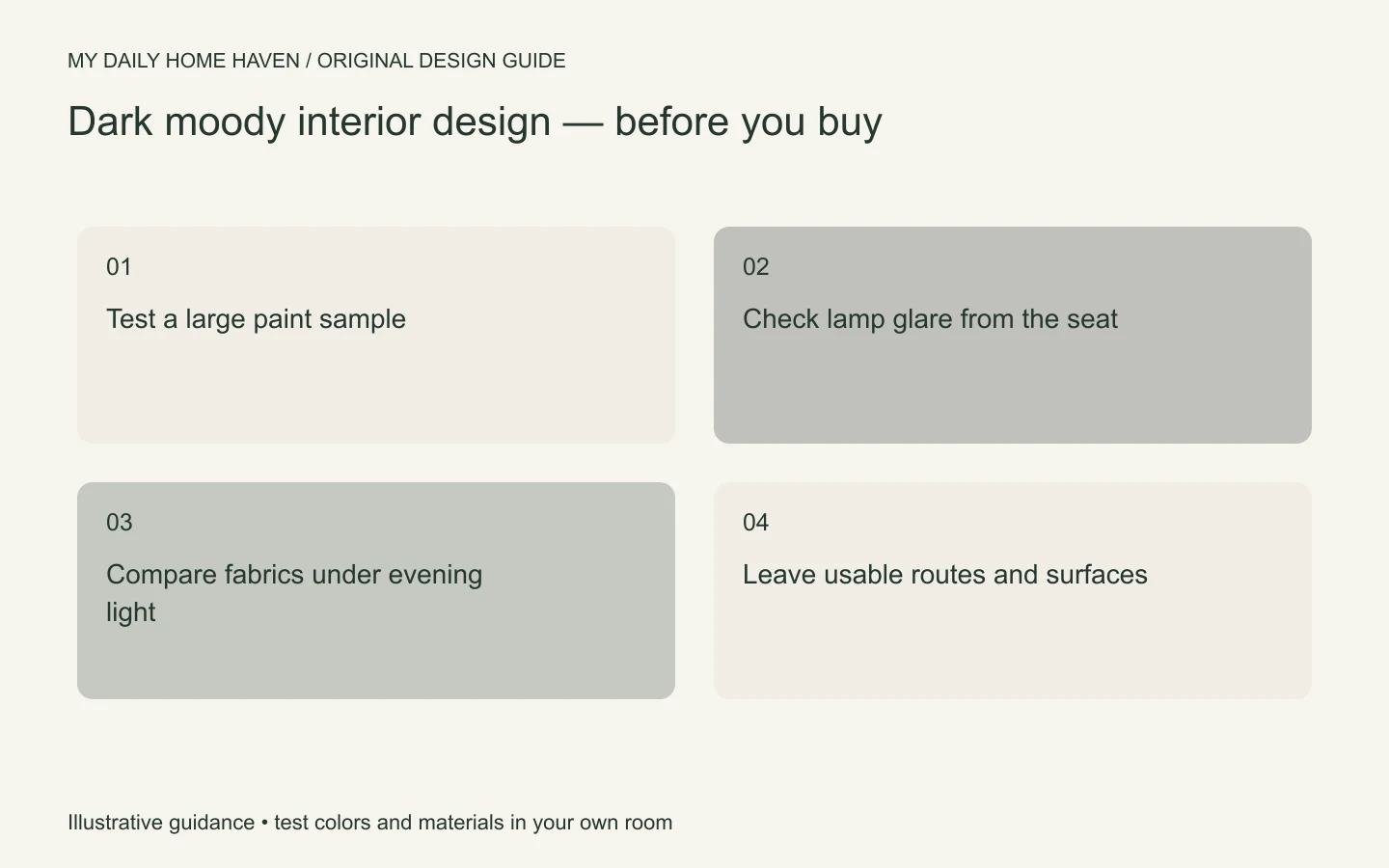
Use a large sample near the floor, upholstery, and trim. Inspect it in bright daylight, dull weather if possible, and normal evening lighting. Deep colors can show undertones that are less obvious on a small chip.
Benjamin Moore’s color handbook explains that light changes how a paint color appears. For a room used mainly at night, the evening test is particularly important. A beautiful daytime sample may be too close to black under your lamps.
Choose the intended finish as well as the color. Matte, eggshell, and higher-sheen surfaces behave differently, and suitability varies by product and location. Follow the paint maker’s preparation and cleaning guidance rather than choosing sheen only for a photograph.
Separate surfaces with value and texture
A dark sofa against a similarly dark wall can disappear visually. That may be deliberate, but if the room feels indistinct, add a lighter rug, a different fabric texture, or a table that creates a clear edge. You do not need a bright accent everywhere.
Mix smooth and tactile materials so the room has depth. Velvet, woven fabric, wood grain, and a quieter painted surface reflect light differently. Avoid making every piece glossy or every piece heavily textured.
Small metallic accents can catch light, but they do not replace a lighting plan. Use them selectively and check glare. A reflective surface placed poorly may create an uncomfortable bright spot instead of a richer atmosphere.
Plan light around activities
Provide ambient light for moving through the room, task light for reading or work, and accent light only where it adds value. A low-lit photograph may look attractive, but a home needs more than one lighting setting.
Place a reading lamp where the light reaches the page without shining directly into the reader’s eyes. Check the view from the sofa and nearby chairs. Adjustable lamps can be useful when more than one person uses the same seat.
Use compatible dimmers or controls when appropriate, and keep switches easy to reach. Electrical changes should be handled by qualified help where required. Do not rely on decorative string lights or candles as the sole practical lighting.
Choose curtains and rugs with the room in mind
Dark curtains can add continuity, but they may also reduce the perceived width of a window when closed. Test a fabric sample and consider how much daylight and privacy you need. Lining and operation matter as much as the face fabric.
A rug can create a lighter island beneath a dark seating group or reinforce the deeper palette. Check the size against the furniture arrangement and make sure doors still open freely. A very small statement rug may leave the pieces looking disconnected.
Consider visible dust, lint, and maintenance. Deep fabrics and floors are not automatically easier to keep looking tidy. Ask about care and choose finishes that suit your household’s actual tolerance for upkeep.
A room plan to adapt
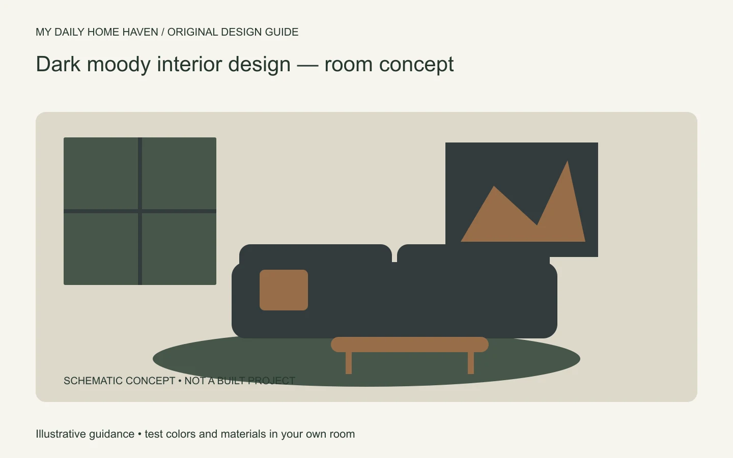
Imagine a living room with deep green walls, a charcoal sofa, and a medium-brown floor. Introduce a lighter textured rug to distinguish the seating from the floor. Add a wood side table and a shaded reading lamp, then keep the main artwork visible with adequate light.
If the scheme feels heavy, try a pale cushion or a lighter curtain sample before repainting. If it feels patchy, reduce unrelated accent colors and repeat one existing tone. Our principles of interior design guide helps assess balance and emphasis.
Use the room for several evenings before the final accessory purchase. Notice where you strain to see or where glare distracts you. Fix those problems first; atmosphere is more convincing when the room works comfortably.
Provide a practical brighter setting
A dark moody interior design scheme still needs a setting for ordinary tasks. Keep enough controllable light for cleaning, checking clothing, finding a dropped object, or helping a guest move through the room. You can return to a softer atmosphere afterwards. Test the switches from the entrance so nobody has to cross a dark room to reach the first useful lamp. If a room serves several activities, consider how each one changes the lighting requirement. This practical layer makes the deeper palette easier to live with and prevents atmosphere from becoming an obstacle to everyday use.
Frequently asked questions
Should the ceiling also be dark?
It can be, but test the full relationship with walls, trim, and lighting. A lighter ceiling is also valid. There is no rule that every surface must share one color.
Can renters create a moody room?
Yes. Use deeper textiles, artwork, a rug, and useful shaded lamps while keeping changes reversible and following the rental agreement. Paint is only one route to the effect.
Will more lamps always solve a dark room?
No. Placement, output, glare, and the task matter. A few well-positioned sources can be more useful than many decorative lights that do not illuminate what you need to see.
\n\n